How to Trade the W Pattern | Profit from Chart Reversals with Confidence

The W pattern is one of the most powerful and reliable chart reversal signals used by technical traders. This guide breaks down how to spot the W pattern in real-time, what confirms the setup, and how to time your entries and exits for maximum profit. If you’re looking to strengthen your trading edge with chart patterns, this is a must-know formation.


Watch: How to Trade Renko Chart Buy & Sell Signals + W & M Patterns (Complete Strategy Guide)


What Is a W Pattern in Trading?

The W pattern (double bottom) is a bullish reversal made of two distinct troughs (lows) separated by a swing high (the neckline). The pattern completes when price breaks and closes above the neckline. Many traders wait for a decisive close above the neckline before entry; conservative traders prefer a retest of the neckline turning into support.


How to Identify the W Pattern on a Chart

The two troughs don’t have to be perfectly symmetrical. Rough similarity is common, but it’s normal for one trough to be slightly lower/higher. What matters most is the clear neckline (the swing high between troughs) and a strong breakout through it.

With the W pattern in place, investors can expect further price rises.
The W pattern formed, creating a strong bullish indication and sending Adobe shares higher.
Adobe stock rose due to the formation of the W pattern, a highly reliable bullish signal.

How to Trade the W Pattern Step by Step

When the W pattern forms, it signals a potential shift from downtrend to uptrend. Entries are typically taken on a decisive close above the neckline (or on a retest of the neckline that holds as support). Always define risk before entry.

Entry, Stops, & Targets

Invalidation: A sustained move back below the neckline after breakout weakens the pattern.

Entry: Close above the neckline (aggressive) or successful neckline retest (conservative).

Stop-loss: Commonly below the second trough (more conservative) or below the retest low if entering on a pullback.

Target (measured move): Measure the vertical distance from the neckline down to the lower of the two troughs (or their average), then project that distance upward from the neckline.

How to Trade W Pattern in Forex or Stock

  1. Identifying the Formation:
    • Recognize the W pattern on the chart, indicating an upcoming upward move in the market.
  2. Strategic Buying:
    • Wait for a close above the neckline or a successful neckline retest before entering long.
  3. Comprehensive Analysis:
    • Incorporate the W pattern into your overall market analysis.
    • Avoid relying solely on the pattern; integrate it with fundamental and technical analyses for optimal results.

When to Trade the W Pattern

The W pattern proves effective as a bullish signal in specific market conditions:

  • Market context:
    • Best after a downtrend or range where sellers begin to lose momentum.
  • Key characteristics:
    • Trough 1 → Neckline → Trough 2: Two lows separated by a clear swing high.
    • Approximate symmetry is fine: The two troughs need not be identical.
    • Confirmation: A decisive break/close above the neckline completes the pattern.
  • Buy signal:
    • Enter on a close above the neckline (aggressive) or on a successful neckline retest (conservative).
    • Be prepared for false breakouts; define risk and stick to your stop.

📌 W Pattern in Forex, Stocks, and Crypto

The W pattern is a universal chart formation that shows up across all markets. Whether you’re trading currencies, stocks, or cryptocurrencies, the psychology behind the pattern remains the same: sellers lose momentum at the second bottom, and buyers step in to push prices higher. Still, each market has unique characteristics:

  • Forex: In forex trading, the W pattern often appears after extended downtrends during major sessions. Because currency markets are highly liquid, traders usually wait for confirmation with volume indicators or a breakout candle above the neckline before entering.
  • Stocks: Stock traders frequently use the W pattern to spot reversal opportunities after earnings dips or sell-offs. A breakout above resistance can suggest strong institutional buying, making it a popular setup on daily and weekly charts.
  • Crypto: Due to high volatility, W patterns in crypto can complete quickly, sometimes within hours. Traders typically combine the pattern with moving averages or RSI divergence to avoid false signals and confirm stronger reversals.

👉 The key takeaway: the W pattern adapts well across asset classes, but confirmation tools and timeframes matter depending on the market you trade.


📌 Indicators That Confirm a W Reversal

While the W pattern is powerful on its own, traders often look for technical indicators to confirm the reversal before committing capital. Some of the most effective confirmations include:

  • Volume Breakouts: A sharp increase in volume when price breaks above the neckline strengthens the signal that buyers are stepping in.
  • RSI Divergence: If the Relative Strength Index shows higher lows while price forms lower lows, it suggests selling pressure is weakening — a classic bullish divergence that supports the W formation.
  • Moving Averages: When short-term moving averages (e.g., 10- or 20-period) cross above longer-term ones, it aligns with the bullish reversal implied by the W pattern.
  • MACD Crossovers: A MACD line crossing above the signal line after the second bottom can reinforce the bullish outlook.

👉 By combining chart structure with indicator confirmation, traders can filter out false setups and increase their confidence in W pattern trades.


W Pattern vs. M Pattern (Double Top)

In contrast, the M pattern, also known as the double top, signifies an impending market decline. Here’s how to navigate it:

  • Formation Recognition:
    • Identify the M pattern on the chart, indicating an upcoming downward move.
  • Strategic Selling:
    • Short on a decisive break/close below the neckline (the swing low between the two tops).
    • Stops: Often above the second top; conservative traders use above the higher top.
    • Target (measured move): Distance from neckline to higher top, projected downward.
  • False Signals:
    • Be aware of the potential for false breakout signals and have a strategy to address them.

In summary, mastering the W pattern involves strategic buying, thorough analysis, and risk management. Always be mindful of the market context and consider the M pattern as a contrasting signal for potential market declines.

Agilent Technologies (A) has recently formed a double top M pattern on the chart. The share price has been troubling for some time.

📌 Advantages and Disadvantages of Trading the W Pattern

Like any chart formation, the W pattern has both strengths and weaknesses. Understanding these will help you decide when to use it and when to be cautious.

✅ Advantages

  • Clear Entry & Exit Points: The neckline provides a natural breakout level, while the second bottom acts as a reference for stop-loss placement.
  • Strong Reversal Potential: Because the pattern forms after sellers fail twice to push prices lower, it often signals the beginning of a meaningful trend change.
  • Works Across Markets & Timeframes: The W formation is visible in forex, stocks, and crypto, from intraday charts to weekly setups.
  • Easy to Spot: Even newer traders can visually recognize the double-bottom shape without advanced tools.

⚠️ Disadvantages

  • False Breakouts: Prices can sometimes break above the neckline temporarily and then reverse back down, trapping early buyers.
  • Patience Required: The second bottom may take time to form, and traders who enter too early risk premature losses.
  • Confirmation Needed: Without volume or indicator support, the W pattern alone may not provide enough evidence of a true reversal.
  • Risk of Overuse: Traders may force the pattern onto price action that doesn’t fully meet the criteria, leading to inconsistent results.

👉 The bottom line: The W pattern is powerful when combined with patience and confirmation tools, but relying on it alone can expose you to unnecessary risk.


❓ Frequently Asked Questions about the W Pattern

Is the W pattern bullish or bearish?

The W pattern is generally considered a bullish reversal signal. It forms after a downtrend and suggests the market is likely to turn upward once the second bottom is confirmed.


What timeframes work best for W pattern trading?

The W pattern can be applied across multiple timeframes, but traders often find it most reliable on the 1-hour, 4-hour, and daily charts. Longer timeframes help filter out noise and provide stronger reversal signals.


Which indicators confirm a W reversal?

Popular indicators that help confirm a W pattern include:

  • Volume spikes at the breakout level
  • RSI divergence showing weakening selling pressure
  • Moving average crossovers pointing to trend reversal

These tools provide extra confirmation before entering a trade.


How does the W pattern compare to the M pattern?

The W pattern is bullish, signaling an upward reversal, while the M pattern is bearish, signaling a downward reversal. Both are double-formation chart patterns, but they suggest opposite market outcomes.


Final Thoughts on W Pattern Trading

In conclusion, the W pattern emerges as a valuable and reliable technical indicator for traders aiming to enhance their profitability in the markets. Its simplicity, coupled with the ability to identify reversals and optimize timing, makes it an attractive choice for investors. However, traders should be mindful of its limitations, including the potential for false signals, and consider incorporating the W pattern into a comprehensive trading plan that includes other indicators and analysis tools. With practice and experience, traders can leverage the strengths of the W pattern to bolster their success in the dynamic world of stock trading.

Master Renko Trading Strategies with Confidence

Master Trading Strategies with Confidence

Explore proven chart patterns and Renko-based techniques to improve decision-making, ride trends longer, and avoid whipsaws. Every guide provides clear, actionable steps and practical tips, covering a variety of Renko trading strategies to help you execute with precision and confidence.

Your Guide to Renko Trading Strategies

What are Renko trading strategies? They are step-by-step methods for using Renko charts to find clearer buy and sell signals, reduce whipsaws, and improve timing across any market. In this guide, you’ll discover 7 proven Renko strategies with practical examples for stocks, forex, and crypto in 2025.

This hub curates the most useful strategy content on Lacois. Whether you prefer the structure of Renko charts or pattern-driven setups like the W formation, you’ll find step-by-step rules, context for entries and exits, and links to deeper dives.

Best Renko Trading Strategies Explained

Below you’ll find a curated set of Renko trading strategies — from basic patterns to advanced techniques. Each guide includes step-by-step rules, entry and exit ideas, and practical examples for stocks, forex, and crypto.

See the Setups in Action

Get visual walkthroughs, labeled examples, and strategy updates on YouTube.

Subscribe on YouTube
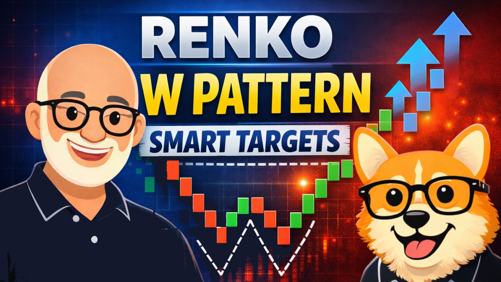
Renko trading strategies illustrated with charts, Carl's avatar, and Bax the corgi

Renko Chart Strategies: Master Techniques for Effective Trading

Looking to cut through market noise and trade trends with more confidence? Renko chart strategies give traders a unique edge by focusing only on significant price movement — not time. In this guide, you’ll discover how to use Renko charts effectively, from ATR-based setups to EMA crossovers and RSI pullbacks. Whether you trade forex, stocks, or crypto, these strategies can help you identify clearer trends, make smarter entries, and hold your winners longer.


📌 Quick Summary: Mastering Renko Chart Strategies

🔍 Focus Price action (not time)
🧠 Best For Trend followers & swing traders
🛠 Key Strategies ATR Renko, EMA crossover, RSI pullback
✅ Core Benefits Noise reduction, trend clarity, simple entries
⚠️ Watch Out For Choppy markets, bad brick sizing
📊 Tools You’ll Need TradingView, MT4/5, Thinkorswim, NinjaTrader

Prefer to watch how it works in real trade scenarios? Want to catch price reversals early—without getting faked out? In this video, we combine Renko charts, RSI, and MACD to help you anticipate potential turning points in the market. But here’s the twist: early signals are great, only if you wait for confirmation.


🧱 What Are Renko Chart Strategies?

Renko chart strategies are price action-based trading techniques that rely on Renko charts, a type of chart that filters out time and focuses only on price movement. Unlike candlestick or bar charts, Renko charts display “bricks” that form only when price moves a fixed amount (or a dynamic amount, such as ATR). This makes them excellent for highlighting market trends while eliminating minor fluctuations.

These strategies help traders:

  • Focus on real price movement
  • Avoid false signals from low-volume noise
  • Identify clear trend changes and breakouts

Whether you’re trading forex, stocks, crypto, or indices, Renko charts can bring clarity to your decision-making.


🎯 Why Choose Renko Charts?

Renko charts are especially helpful for traders who:

  • Get overwhelmed by candlestick noise
  • Miss major trends due to early exits
  • Prefer clean visual confirmation for trend entries

Key benefits include:

  • Noise reduction – No time-based candles to distort market flow
  • Clearer trends – Bricks only form on significant moves
  • Simpler rules – Easier to build consistent systems

📌 Renko is ideal for traders who value trend clarity over market detail.


🚀 Key Renko Chart Strategies to Master

📏 ATR-Based Renko Charts (Dynamic Brick Sizing)

How it works: This strategy uses the Average True Range (ATR) to calculate dynamic brick sizes based on market volatility.

  • If the market is volatile, bricks get larger.
  • If the market slows, bricks shrink.

Example Setup:

  • ATR(14) applied to daily chart
  • Brick size: Dynamic using current ATR
  • Entry: Price closes above/below recent swing + trendline break
  • Exit: Opposite color brick or trailing stop

Best for: Traders who want the chart to “breathe” with volatility — especially useful in forex or crypto where volatility fluctuates intraday.

Pro tip: Combine with a 50-period EMA. Only take trades in the direction of the slope.


🧱 Traditional Fixed-Size Renko Strategy

How it works: You choose a specific brick size (e.g., $1.00 or 10 points), and the chart builds bricks only when that amount of movement occurs.

Why it works:

  • Simpler for backtesting and rule creation
  • Ideal for traders who prefer mechanical setups

Example Setup:

  • Brick size: 0.5% of current price
  • Entry: Breakout of previous brick high/low
  • Add: Volume filter to confirm real participation
  • Exit: Opposite brick or fixed target (e.g., 2R)

Best for: Trend-following stock traders who prefer stability over adaptability.


Strategies are most effective when you stay disciplined. That means avoiding errors like poor brick size choices or chasing reversals. You can review the Top 5 Renko Mistakes to strengthen the foundation before applying these techniques.


🔁 Renko + Moving Average Crossovers

2D illustration of a smart meerkat wearing glasses, pointing at a Renko chart with red and blue bricks, labeled 'Buy Entry', against a vibrant blue background with trendlines. Promotes Renko chart strategies for smarter trading.

Strategy Setup:

  • Add two EMAs to your Renko chart: 10 EMA and 25 EMA
  • Buy when 10 EMA crosses above 25 EMA on bullish Renko bricks
  • Sell when 10 EMA crosses below 25 EMA on bearish bricks

Benefits:

  • Simple and effective in trending markets
  • Offers clear confirmation and dynamic exits

Drawbacks:

  • Lags in choppy conditions
  • Can create whipsaws if brick size is too small

Pro tip: Use the slope of the EMAs as a filter — only trade when both are rising or falling together.


📉 Renko + RSI Pullback Strategy

This strategy combines the clarity of Renko bricks with the power of momentum reversion via the RSI.

Setup:

  • Use fixed or ATR-based Renko chart
  • RSI(14) added on separate panel
  • Buy when RSI dips below 40 and bricks are bullish
  • Sell when RSI peaks above 60 and bearish brick follows

Why it works:

  • Allows you to enter trends at better prices
  • Combines confirmation with mean-reversion logic

Best for: Traders who want to enter on dips, not breakouts.

Explore more: Watch the video, “Spot Early Reversals with Renko, RSI & MACD — But Wait for Confirmation!”


⚖️ Renko vs. Candlestick Charts

FeatureRenko ChartCandlestick Chart
Time-based?❌ No✅ Yes
Shows wicks?❌ No✅ Yes
Chart clarityHighModerate
Ideal forTrend followingPattern recognition
Filters market noise?✅ Yes❌ No

📝 Renko charts are a trend trader’s best friend. Candlesticks are better for scalpers and pattern-based strategies like inside bars or pin bars.


❌ Common Mistakes in Renko Trading

  1. Using inappropriate brick sizes
    Small bricks = choppy charts. Large bricks = late entries. Always backtest.
  2. Ignoring confirmation tools
    Don’t trade bricks alone — use trendlines, indicators, or volume.
  3. Overtrading sideways markets
    Renko thrives in trending environments. Sideways markets produce fakeouts.
  4. Switching strategies too often
    Consistency matters more than perfection. Stick with one method through a full market cycle.

🛠️ Best Tools for Renko Charting

  • TradingView – Clean, real-time Renko charts (both fixed and ATR-based)
  • MetaTrader 4/5 – Supports Renko via custom indicators or plugins
  • NinjaTrader – Advanced Renko types, good for futures traders
  • Thinkorswim – Built-in Renko charting for stocks and options
  • Sierra Chart – Popular among pros for Renko backtesting

📌 Tip: Always verify that your platform supports custom brick sizes and non-time-based charts.


🧠 Pro Tips for Effective Use

  • 🧪 Use ATR Renko for modern, fast-moving markets like crypto or forex
  • 🧰 Stick to fixed Renko for backtesting ease and mechanical trading
  • 🔍 Don’t go indicator-heavy — the chart itself is the strategy
  • 📈 Backtest at least 6 months of data before going live
  • 🔁 Practice in simulated environments (demo accounts) to build confidence

❓ Frequently Asked Questions

Q: What’s the best Renko strategy for beginners?
A: Start with fixed-size Renko charts and a 50 EMA for trend direction. Look for breakouts and test with small positions.

Q: Can I use Renko charts for day trading?
A: Absolutely. Use smaller brick sizes (e.g., 5–10 ticks) and confirm trades with RSI or fast EMAs.

Q: How do I choose the right brick size?
A: For dynamic sizing, use ATR(14). For static sizing, use 0.5%–1% of the asset’s price and adjust based on backtests.

Q: Are Renko charts suitable for scalping?
A: Not ideal — Renko is better for swing and trend trades. For scalping, candlestick charts with fast timeframes are more reactive.


🧭 Final Thoughts

Renko chart strategies offer a clean, data-driven way to reduce market noise, simplify your decision-making, and stay in trades longer. By combining brick logic with indicators like ATR, EMAs, or RSI, you can build systems that are both disciplined and flexible.

Whether you’re just starting out or fine-tuning a professional edge, Renko strategies are worth exploring — especially if you’re tired of choppy candlestick charts and conflicting signals.

Crypto Mastery: 7 Dynamic Renko Strategies for Price Precision

Cryptocurrency trading has taken the financial world by storm, offering exciting opportunities and challenges. As digital assets like Bitcoin, Ethereum, and others continue to capture attention, mastering effective trading strategies becomes crucial. One such strategy that has gained popularity is the use of Renko charts. In this article, we will delve into 7 dynamic Renko strategies that can enhance your price analysis precision in the volatile world of cryptocurrencies.

What are Renko Charts?

Renko charts are a unique form of technical analysis that focuses solely on price movements, disregarding time and volume. These charts are built using bricks or “blocks,” which represent a predetermined price movement. Unlike traditional candlestick charts, Renko charts help traders filter out market noise and provide clearer insights into trend direction and key support/resistance levels.

The Power of Renko Strategies in Crypto Analysis

Cryptocurrencies are known for their unpredictable price fluctuations and quick market shifts, making them a prime candidate for Renko chart analysis. Renko strategies emphasize substantial price movements while minimizing minor fluctuations, offering a powerful approach to enhance your crypto trading endeavors. Let’s delve into 7 dynamic Renko strategies that can amplify your prowess in the crypto trading arena:

1. Trend Identification with Renko

Using Renko charts to identify trends can greatly improve your trading accuracy. A series of upward (bullish) or downward (bearish) bricks forming on the chart signifies a trend. This helps you enter trades in alignment with the prevailing market direction, increasing the probability of profitable trades.

Example: Suppose you’re analyzing the Ethereum/USD pair. By observing a consistent pattern of upward green bricks, you can confidently infer an ongoing uptrend. This insight can guide your trading decisions, leading to better trade entries and exits.

Case Study: During the bull market of 2021, Bitcoin exhibited a prolonged uptrend on Renko charts, allowing traders to ride the wave and maximize profits.

Renko strategies: trend following on the Bitcoin Renko chart

2. Support and Resistance Zones

Renko charts make support and resistance levels more apparent than traditional charts. Price bounces off these levels with greater clarity, enabling traders to make informed decisions based on historical data.

Example: Let’s say you’re analyzing Ripple (XRP) using Renko charts. As the price consistently bounces off a specific Renko support level, you can establish this level as a strong support zone. When making trading decisions, you can factor in this level as a potential area for price reversals.

Case Study: In early 2021, Ethereum encountered strong resistance around the $1,800 mark on Renko charts. Traders who recognized this resistance zone could have strategically entered short positions to profit from the subsequent price drop.

3. Volatility-Based Stops

Cryptocurrencies’ inherent volatility makes accurate stop-loss placement crucial. Renko charts eliminate time-based noise, making it easier to set stop-loss orders based on volatility.

Example: Imagine analyzing Litecoin’s price movement using Renko charts. Due to Litecoin’s price volatility, using a traditional time-based stop-loss might lead to premature exits. However, by placing your stop-loss below or above significant Renko brick levels, you can better account for price fluctuations.

Case Study: During the market crash in May 2021, Bitcoin’s price on Renko charts experienced rapid drops. Traders who set their stop-loss levels based on Renko brick formations could have mitigated losses more effectively.

Renko strategies: Renko charts enhance stop-loss accuracy by eliminating time-based noise, aligning with cryptocurrency's volatility for precise placements.

4. Renko Patterns

Similar to candlestick patterns, Renko charts have their own set of patterns that can provide valuable insights into potential trend reversals.

Example: Suppose you’re analyzing Cardano (ADA) on Renko charts and you spot a “Triple Top” pattern forming. This formation consists of three consecutive bricks reaching a similar price level. Recognizing this pattern could signal an upcoming trend reversal, allowing you to adjust your trading strategy accordingly.

Case Study: In late 2020, Ethereum Classic exhibited a “Double Bottom” pattern on Renko charts, indicating a potential trend reversal. Traders who identified this pattern could have anticipated the subsequent bullish move.

Renko strategies: Renko charts showcase distinct patterns, aiding trend reversal predictions. E.g., "Triple Top" signals trend shift like Ethereum Classic's "Double Bottom."

Unveiling Renko Chart Patterns: A Comprehensive Overview

5. Breakout Confirmation

Renko charts are excellent tools for confirming breakouts. When a brick moves beyond a defined resistance or support level, it indicates a breakout, helping traders capitalize on these movements with greater confidence.

Example: Analyzing the Binance Coin (BNB) price on Renko charts, you notice a series of green bricks consistently breaking above a resistance level. This breakout confirmation can serve as a strong signal to enter a long position, anticipating further price appreciation.

Case Study: In early 2021, Cardano (ADA) exhibited a strong breakout above a key resistance level on Renko charts. Traders who recognized this breakout could have entered positions early and profited from the subsequent uptrend.

Renko strategies: Renko charts confirm breakouts by brick movement past resistance/support, guiding traders for favorable entries and profits.

Mastering Renko Charts Technical Analysis: A Comprehensive Guide

6. Multiple Timeframe Analysis

Combining Renko charts of different brick sizes allows for comprehensive multiple timeframe analysis. This approach provides a holistic view of the trend, helping traders make more accurate predictions.

Example: Suppose you’re analyzing Bitcoin’s price using both daily and hourly Renko charts. The daily chart provides a broader trend perspective, while the hourly chart offers finer details. By aligning signals from both charts, you can make well-informed trading decisions.

Case Study: During the market consolidation phase in 2022, Ethereum’s price exhibited different trends on various Renko timeframes. Traders who integrated insights from both short and long-term Renko charts could have adapted their strategies accordingly.

7. Dynamic Entry and Exit Points

Renko strategies facilitate dynamic entry and exit points. By entering trades at specific brick formations and exiting when trends show signs of reversal, traders can optimize their risk-reward ratio.

Example: Analyzing Dogecoin (DOGE) using Renko charts, you identify a bullish trend characterized by consistent green bricks. As the trend progresses, you notice a formation of red bricks, indicating a potential reversal. This insight prompts you to exit the trade before significant losses occur.

Case Study: In the volatile market of early 2021, Polkadot (DOT) exhibited rapid price fluctuations on Renko charts. Traders who closely monitored brick formations could have made timely decisions to capitalize on price movements.

Combining Renko Charts with Cryptocurrency Fundamentals

While Renko strategies offer valuable insights into price movements, augmenting them with technical and fundamental analyses results in a comprehensive trading approach. Cryptocurrencies are impacted by diverse factors such as technological advancements, regulatory updates, and market sentiment. Incorporating these fundamentals alongside Renko chart analysis enriches your decision-making process.

Example: Suppose you’re considering a trade on a particular cryptocurrency based on a bullish pattern you identified using Renko charts. Before entering the trade, you research the cryptocurrency’s upcoming protocol upgrade, which has the potential to significantly impact its price. By factoring in this fundamental aspect, you can make a more informed decision and adjust your trading strategy accordingly.

Case Study: In 2020, Chainlink (LINK) exhibited a strong bullish trend on Renko charts. Simultaneously, the project announced a partnership with a major technology company, creating a surge in market sentiment. Traders who combined their Renko analysis with this fundamental news could have entered the trade with increased confidence, capitalizing on both technical and fundamental factors.

Risks of Overemphasizing Fundamentals

While blending fundamentals with Renko strategies can offer advantages, maintaining a balance is crucial. Overemphasizing fundamentals without factoring in technical patterns can result in missed opportunities and less effective trading choices. Likewise, relying exclusively on Renko charts without considering underlying fundamentals may leave traders vulnerable to unexpected market fluctuations.

Risks of Using Renko Charts for Crypto Trading

**Renko Chart Risks:**

1. Limited history for trends.
2. False signals from spikes.
3. Missed short-term chances.
4. Key brick size choice.
5. Incomplete extreme volatility.
6. Complexity for newcomers.
7. Asset incompatibility.

While Renko charts offer powerful insights, they are not without risks. Traders should be aware of the following potential pitfalls when incorporating Renko strategies into their cryptocurrency trading:

1. Limited Historical Data

Renko charts disregard time and focus solely on price movements. This can result in a limited historical view, making it challenging to analyze long-term trends accurately.

2. False Signals

Like any technical analysis tool, Renko charts can produce false signals. Sudden price spikes or drops can create bricks that might not accurately reflect the actual trend direction.

3. Missed Opportunities

Renko charts can filter out small price movements, potentially causing traders to miss out on short-term opportunities or reversals that could be visible on traditional charts.

4. Brick Size Selection

Choosing the appropriate brick size is crucial for accurate analysis. Selecting a brick size that’s too large might obscure important price movements, while a size that’s too small might lead to excessive noise.

ATR-Based Renko Chart Brick Size Calculation: Proven Tips and Tricks

5. Market Volatility

While Renko charts can help manage volatility, extreme market conditions can still lead to rapid price swings that might not be adequately captured by brick formations.

6. Complexity

Renko charts require a deep understanding of their mechanics. Novice traders might struggle to interpret patterns and signals accurately.

7. Incompatibility with All Assets

Renko charts might not be suitable for all types of assets or markets. Different assets exhibit varying levels of price volatility, affecting the effectiveness of Renko analysis.

Real-World Examples

Let’s examine a real-world example to illustrate the potential risks of using Renko charts in crypto trading:

Case Study: In 2020, a popular cryptocurrency experienced a sudden flash crash due to a liquidity shortage. Renko charts, despite their noise-filtering capabilities, struggled to accurately capture this sharp drop, potentially leading traders to overlook or misinterpret the severity of the situation.

Cryptocurrency Explained With Pros and Cons for Investment

Conclusion

In the dynamic world of cryptocurrency trading, incorporating both Renko charts and fundamental analysis can provide a well-rounded approach. Renko strategies offer a unique advantage by highlighting significant price movements, while fundamentals shed light on broader market dynamics. By integrating these approaches, traders can make more informed decisions, mitigate risks, and seize opportunities in the ever-evolving crypto landscape. Remember that both technical and fundamental aspects play a crucial role in successful trading. Incorporate these strategies into your crypto trading arsenal and elevate your mastery of the market.