How to Trade Renko Charts: Buy and Sell Signals Explained Step-by-Step (2025 Guide)

Learning how to trade Renko charts using buy and sell signals is a powerful way to simplify your trading decisions by focusing purely on price action. Unlike traditional charts, Renko charts filter out market noise, making it easier to spot clean trend reversals and entry points.

In this guide, you’ll learn exactly how to trade Renko charts by setting them up correctly, choosing the right brick size, and applying proven patterns to enter and exit trades with confidence. This tutorial covers everything you need to know about using Renko chart buy and sell signals in real-world trading.

🔎 Quick Summary:
  • Renko charts focus on price changes, filtering out market noise.
  • Brick size can be set traditionally or using ATR for volatility adjustment.
  • Patterns like W, M, and Head & Shoulders help identify trend reversals.
  • Support and resistance levels are crucial for entry and exit points.
  • Risk management involves setting stop-losses based on chart patterns.

If you’re new to Renko charts, start with this beginner’s guide to understand how they work before diving into signals.


🔍 Renko Charts Explained — A Simpler Way to Read Price

Renko charts filter out the noise.

Instead of tracking every wiggle like candlesticks, Renko charts focus only on meaningful price movement. They build clean, brick-style visuals that help you see the trend—fast.

Here’s the key difference:

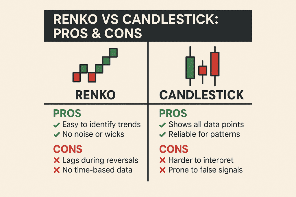
  • 📉 Candlesticks: show every tick, including the noise
  • 🧱 Renko charts: only form a new brick when price moves a set amount

This means fewer distractions, smoother trendlines, and way better clarity for spotting buy and sell signals.

Whether you’re a day trader or long-term investor, Renko charts can help you cut through the clutter and make smarter entries.


💡 Why Use Renko Charts?

  • Easy to spot trends
  • Helps reduce false signals
  • Works with any asset: stocks, forex, crypto, options

If you’ve ever felt overwhelmed by busy charts—this might be the visual style you’ve been missing.


👇 In This Guide:

  • How to set up Renko charts the right way
  • What brick size matters (and how to choose it)
  • Patterns that reveal high-probability trades
  • How to confirm signals using support/resistance

Let’s get into it.


How to Trade Renko Charts: Key Strategies and Tips like Buy and Sell Signals example with ATR strategy

🛠️ How to Trade Renko Charts: Key Strategies and Tips

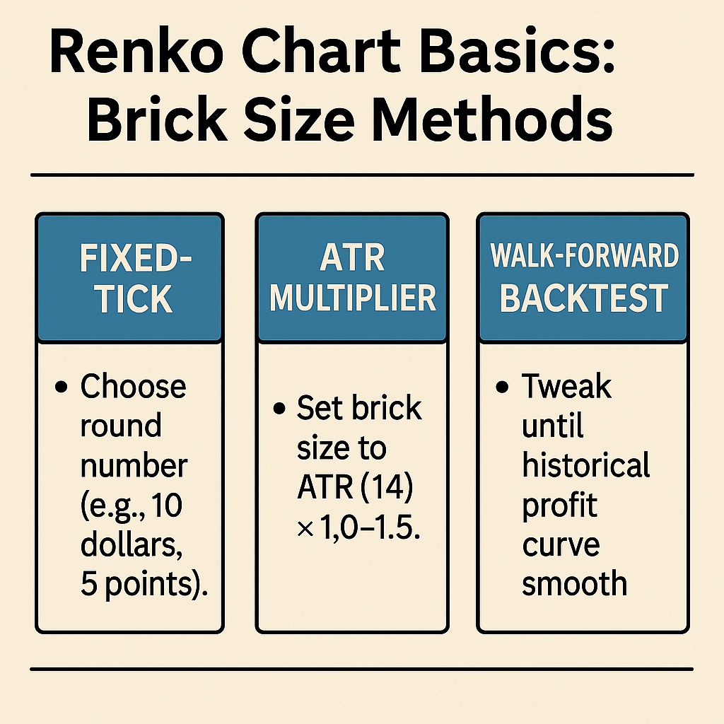
When learning how to trade Renko charts, selecting the appropriate brick size is crucial for accurate signal interpretation.

You’ve got two main options:

🔹 Fixed Brick Size

This is a simple setup. You choose a set value—say $1 or $5—and the chart only draws a new brick if the price moves that amount. It gives you a very clean chart, but it doesn’t adjust when the market gets more or less volatile.

🔹 ATR-Based Brick Size

This method uses the Average True Range (ATR) to automatically adjust your brick size based on recent market movement. It’s more dynamic and helps your chart stay relevant in fast-changing or slower conditions.

👉 Example:
If volatility spikes, the ATR increases, and your brick size gets larger—filtering out more “noise.”
If things calm down, the bricks get smaller—helping you catch subtle moves.


✅ Which One Should You Use?

If you’re just getting started, a fixed size keeps things simple.
If you want better accuracy as you trade live markets, ATR-based sizing is worth trying.

Need help setting that up? Check out this guide:
👉 ATR-Based Renko Brick Size Strategy


💡 Pro Tip:

Stick with one method for a while so you can spot patterns more clearly. Don’t switch brick sizes too often—it messes with your trend perspective.


Mastering Support and Resistance Zones. A guide to increasing profitability in trading.

📏 Spotting Support and Resistance with Renko Charts

Support and resistance levels are key to making Renko chart signals more reliable. The beauty of Renko is that it makes these levels way easier to spot than on messy candlestick charts.


🔹 What is Support?

Support is where the price tends to bounce upward. On a Renko chart, this often looks like a clear floor—a horizontal level where bricks stop falling and start rising again.

👉 If the price has touched the same low two or three times and bounced, that’s a solid support zone.


🔹 What is Resistance?

Resistance is the opposite—it’s where price tends to stall and reverse downward. Think of it as a ceiling on your chart. If bricks keep hitting the same high and then turning red, you’re probably seeing a resistance level.


📊 Why These Levels Matter

  • Entries: Buying at support and selling at resistance gives your trades a natural edge.
  • Exits: These levels help you set more logical stop-losses and profit targets.
  • Confirmation: If a buy signal appears right near support, it’s much stronger.

✅ How to Use Support/Resistance with Renko Signals

  1. Draw horizontal lines where price reversed multiple times.
  2. Watch for buy signals near support and sell signals near resistance.
  3. Confirm with pattern formations like W, M, or breakouts.
Support zones on Renko charts. Boeing Company triple buttoms Renko chart patterns.
The SP 500, for example, was under pressure and ultimately broke above the trendline, offering a buying opportunity or closing a short position.
Renko chart support and resistance lines and trendlines are part of the Renko trading strategy to produce Buy Sell Signals

💡 Pro Tip:
When price breaks through a resistance line, it often becomes new support. This “flip” is one of the best signals Renko charts can offer for riding trends.


Chart Patterns and Strategies. Enhancing Trading Insight

📊 Renko Chart Buy and Sell Signals: Patterns That Matter

Once your Renko chart is set up, it’s time to look for patterns that can signal when to buy or sell. These patterns help you spot potential reversals, breakouts, or trend continuations without the noise you’d get from traditional charts.

Here are some of the most useful ones:


🔻 Double Tops & M Patterns (Bearish Reversal)

When you see a Renko chart form a double top—like the letter M—that often signals a potential sell opportunity. It shows price tried to go higher twice but failed, suggesting bearish pressure.

double top on Renko charts
Many traders utilize the double top chart pattern to anticipate trend reversals. When prices fall below the "neckline," the dip between the two peaks, this is seen as confirmation of the reversal pattern.
Double tops are a common chart pattern used to anticipate trend reversals. To confirm the reversal pattern, the price must fall below the “neckline,” the trough between the two peaks.

🔺 Double Bottoms & W Patterns (Bullish Reversal)

A W pattern shows price hit a low, bounced, then retested the low but held—hinting at a potential buy setup. These are common signals for an incoming upward trend.

double bottom on a Renko chart

🧠 Head and Shoulders

Yes, they show up on Renko charts too! The classic head and shoulders pattern is another reversal sign, especially when combined with volume or momentum indicators.


🛠️ How to Use These Patterns

  • Combine with support and resistance levels to filter out weak signals.
  • Wait for confirmation bricks (e.g., a new brick forming in your trade direction).
  • Always set a stop-loss just beyond the recent high or low for safety.

💡 Pro Tip:
Patterns work best when brick sizes are properly tuned. A too-small brick may create noise, while one too large might hide early signals.


✅ Summary:

Renko chart patterns are simple but powerful. Master just a few (like W/M or head and shoulders), and you’ll start seeing clearer signals than most traders using candlesticks.

Renko Chart Patterns

Pattern Details Example Pros Cons
W Pattern (Double Bottom) Anticipates trend reversal when price forms two troughs in a ‘W’ shape. Price of Stock A shows two troughs forming a ‘W’ pattern. – Indicates potential shift from bearish to bullish sentiment.
– Points to buying interest preventing further decline.
– False signals can occur in volatile markets.
M Pattern (Double Top) Suggests trend reversal when price creates two peaks resembling an ‘M’ shape. Stock B’s price forms two peaks forming an ‘M’ pattern. – Alerts potential transition from bullish to bearish momentum.
– Highlights resistance level inhibiting further rise.
– False signals can occur, especially in volatile markets.
Head and Shoulders Pattern Indicates bearish reversal with three peaks: a higher head between two lower shoulders. Stock C’s price demonstrates a Head and Shoulders pattern. – Strong predictor of impending bearish trend reversal.
– Reflects seller influence gaining traction.
– Not all patterns lead to significant reversals.
Inverse Head and Shoulders Pattern Suggests bullish reversal with three troughs: a lower head between two higher shoulders. Stock D’s price forms an Inverse Head and Shoulders pattern. – Signals potential shift from bearish to bullish sentiment.
– Indicates growing buyer enthusiasm.
– Not all patterns lead to strong uptrends.

Mastering Renko Charts Technical Analysis: A Comprehensive Guide


Effective Renko Chart Strategies. Learn how to use Renko charts for profitable trading

Implementing Effective Renko Chart Strategies

Mastering how to trade Renko charts involves understanding key patterns and applying them consistently within your trading plan. Crafting successful trading strategies with Renko charts involves a thoughtful blend of pattern recognition, trendline analysis, and utilization of support and resistance levels. These strategies empower traders to make informed decisions and navigate the complexities of the market with confidence. Here, we outline practical steps for trade management, strategies for loss mitigation, and methods for profit optimization.

Aspect Details Example Pros Cons
Pattern Recognition and Analysis Identifying patterns like W Pattern, M Pattern, Head and Shoulders, Inverse Head and Shoulders. W Pattern indicates potential trend reversal in Company ABC’s stock. Precise signals for potential trend reversals. Patterns may not always guarantee accurate predictions.
Leveraging Trendlines and Support/Resistance Using trendlines, support, and resistance to pinpoint entry and exit points. Ascending trendline and support level in Company XYZ’s stock. Enhanced precision in trading decisions. Market volatility can lead to false breakouts.
Practical Trade Management Setting stop-loss levels, adjusting positions based on evolving trends. Using Inverse Head and Shoulders pattern for trade management. Effective risk management and trade adjustment. Overadjustment can result in missed opportunities.
Strategies for Loss Mitigation and Profit Optimization Utilizing support/resistance for stop-loss orders, employing trailing stop orders. Setting stop-loss below resistance-turned-support in Company DEF’s stock. Limiting losses and securing profits with strategic orders. Trailing stops might lead to premature exits in volatile markets.

Pattern Recognition and Analysis

The cornerstone of a robust Renko chart strategy lies in pattern recognition. Renko charts, with their emphasis on significant price movements, offer a unique vantage point for identifying patterns that might not be as apparent on traditional charts. Patterns like the W Pattern (Double Bottom), M Pattern (Double Top), Head and Shoulders, and Inverse Head and Shoulders can be potent signals for potential trend reversals.

For instance, let’s consider an example involving a W Pattern. Assume Company ABC’s stock has experienced a downtrend, forming two successive troughs with a higher one in the middle. This W Pattern signifies that sellers attempted to drive the price lower but were met with strong buying interest. A break above the pattern’s neckline could indicate an impending upward trend, providing traders with a valuable buy signal.

The triple bottom for Tesla stock below $600 represents a good buying opportunity.
Tesla’s triple bottoms created a buy opportunity below $600.

Leveraging Trendlines and Support/Resistance

Trendlines and support/resistance levels are invaluable tools for entry and exit points. By connecting highs or lows on Renko charts, traders can identify trends and potential turning points. For instance, an ascending trendline formed by linking successive higher lows indicates an uptrend, while a descending trendline suggests a downtrend. Combining these trendlines with support and resistance levels enhances the precision of trading decisions.

Imagine Company XYZ’s stock has displayed an ascending trendline on a Renko chart, indicating an uptrend. Simultaneously, a significant support level has been established at a particular price point. If the stock’s price approaches this support level and aligns with the trendline, it could present an opportune moment to initiate a long position, leveraging the confluence of trend and support.

Through the beginning of 2021, the Exxon Mobile chart displays a very classic W pattern formation. Since then, everyone is aware that Exxon Mobile's stock price has exploded upward.
Through the beginning of 2021, the price chart for Exxon Mobile features a highly traditional illustration of a strong W pattern formation. We are all aware that ever since then, the price of Exxon Mobile shares has skyrocketed.

Practical Trade Management

Renko chart analysis doesn’t stop at pattern identification and entry points; practical trade management is crucial for success. Determine the appropriate stop-loss levels based on the Renko chart’s patterns and support/resistance zones. Adjust your positions according to the evolving trends and price movements to mitigate potential losses.

For instance, let’s say you’ve entered a trade based on an Inverse Head and Shoulders pattern. The neckline serves as your support level, and you’ve set your stop-loss slightly below this level to account for potential fluctuations. As the trade progresses and the stock’s price surges, consider trailing your stop-loss to protect your gains while still allowing room for upward movement.

BP has fallen below the significant support line at $37. At $22 it formed a W pattern, but the rebound failed. After breaking below the W pattern support of $22, the share price fell to $15 before recovering.
BP has fallen below the $37 support level. There was an attempt at a rebound when it created a W pattern at $22, but it failed. A W pattern support level of $22 was breached, and the price dropped to $15 before recovering.

Strategies for Loss Mitigation and Profit Optimization

Risk management is paramount in any trading strategy. Renko charts offer insights that can be instrumental in mitigating losses. By relying on established support and resistance levels, you can set stop-loss orders more strategically. Additionally, employing trailing stop orders that adjust as the price moves in your favor can help secure profits while allowing room for potential gains.

Let’s consider a scenario involving Company DEF’s stock. Using Renko charts, you’ve identified a strong resistance level that aligns with a recent peak. As you enter a short position, you set your stop-loss order just above this resistance-turned-support level. If the stock’s price breaks through this level, your trade is automatically exited, limiting potential losses.

In conclusion, Renko chart strategies revolve around insightful pattern recognition, effective use of trendlines, and careful consideration of support and resistance levels. By implementing practical trade management techniques and employing strategies for loss mitigation and profit optimization, traders can leverage Renko charts’ unique attributes to navigate the markets with precision and confidence.

The chart depicts how we decided to purchase Johnson and Johnson stock. In the event that the shares were not sold at $180, how would the stop-loss strategy prevent further investment losses?

Conclusion: Mastering How to Trade Renko Charts

Renko charts simplify trading by highlighting meaningful price movements and filtering out market noise. By learning how to trade Renko charts using proven signals, patterns, and support/resistance zones, you can make clearer, more confident decisions.

Focus on choosing the right brick size, recognizing key reversal patterns like W and M shapes, and integrating trendlines to boost precision.

Ready to dive deeper? Explore our complete guide to Renko indicators for your next step in mastering Renko trading.

🎯 Want more Renko strategies?
Explore our full collection of Renko trading tutorials, advanced setups, and free tools to sharpen your edge.

Visit Our Renko Hub

Top 5 Renko Chart Indicators for Precise Entry and Exit Signals

Want to get more out of your Renko charts?

In this post, I’ll walk you through 5 of the best Renko chart indicators I’ve used to improve trend detection, filter false signals, and build more confidence in my trades.

Whether you’re just getting started or refining your edge, these indicators — including MACD, RSI, ATR, and more — can supercharge your analysis when paired with Renko’s clean structure.

Let’s get into it.

📊 Quick Summary: 5 Best Indicators for Renko Charts
  • 🧭 MACD – Identifies momentum and crossovers
  • 📈 RSI – Spotting overbought/oversold conditions
  • 📊 Bollinger Bands – Visualize volatility and squeeze setups
  • 📏 ATR – Adjust brick size dynamically for smoother setups
  • ☁️ Ichimoku Cloud – Trend and support/resistance zones

🔥 The Power of Renko Charts

Before we delve into the realm of indicators, let’s briefly explore why Renko charts have garnered so much attention in the realm of technical analysis. Unlike traditional candlestick or bar charts, Renko charts bring a unique perspective to the table. These charts are built on price movement, not time, with each brick (or box) representing a specific price movement threshold. This characteristic filters out market noise, creating a visual representation of trends that is both clear and concise.

Renko charts stand out for several reasons:

  1. Elimination of Noise: By focusing solely on significant price movements, Renko charts remove the clutter caused by minor fluctuations. This clarity can provide a more accurate depiction of trend direction.
  2. Trend Identification: The simplicity of Renko charts allows traders to spot trends more easily. Whether it’s an uptrend, downtrend, or sideways movement, Renko charts can help pinpoint these patterns with precision.
  3. Support and Resistance Levels: Renko charts can uncover support and resistance levels more clearly than traditional charts, aiding in making well-informed entry and exit decisions.

❤️ Understanding Indicator-Based Analysis

While Renko charts offer valuable insights on their own, the power of analysis can be further enhanced with the integration of indicators. These indicators serve as dynamic tools that provide additional layers of information to traders and investors. They assist in confirming trends, identifying potential reversals, and generating timely signals for buy or sell decisions.

When it comes to Renko chart analysis, it’s crucial to choose indicators that align with the unique characteristics of these charts. The goal is to enhance your understanding of price movement and market sentiment, ultimately leading to more successful trades.


🌎 Exploring Dynamic Renko Chart Indicators

In the world of technical analysis, dynamic indicators play a pivotal role in deciphering complex market movements. When combined with Renko charts, these indicators can provide a comprehensive view of price trends, making them a potent tool for traders and investors alike. Let’s delve into the realm of dynamic indicators and their significance in Renko chart analysis.

Unveiling the Power of Dynamic Indicators

Dynamic indicators are designed to adjust their parameters based on the changing market conditions. This adaptability allows them to provide accurate insights across various chart types, including the unique structure of Renko charts. By capturing nuanced price movements, dynamic indicators enhance the precision of your analysis, leading to more informed trading decisions.


1. MACD – Spot Momentum and Trend Shifts

MACD works surprisingly well with Renko charts — even though it’s a traditional time-based indicator.

Here’s what makes it powerful:

  • It shows momentum clearly using two moving averages
  • When the MACD line crosses the signal line, it can confirm a Renko breakout or signal a trend shift
  • The histogram helps gauge strength — wider bars = stronger move

💬 Tip: I like using MACD alongside Renko when I want to ride a trend longer but avoid getting faked out on small pullbacks.

Renko chart indicators: MACD on the American Express Renko chart.

2. RSI – Catch Overbought or Oversold Zones

RSI (Relative Strength Index) helps you spot when the market might be stretched — either too high or too low — which works great with Renko’s clean structure.

Here’s how I use it:

  • If RSI crosses above 70, I watch for signs of slowing momentum — maybe a trendline break or reversal
  • If it dips below 30, I stay alert for a W pattern or bullish confirmation
  • When RSI diverges from price (like making lower highs while price makes higher highs), that’s an early warning

💬 Tip: On Renko charts, RSI is easier to trust because it filters out the noise that makes it twitchy on candlesticks.

Renko chart indicators: RSI on the Apple Renko chart

3. Bollinger Bands – Visualize Volatility and Breakouts

Bollinger Bands wrap around price action to show volatility — and with Renko charts, they’re even easier to read.

Here’s how I use them:

  • When Renko bricks start pushing outside the upper or lower band, it signals strong momentum
  • A tight squeeze (when the bands narrow) means a breakout is coming — great for catching early moves
  • Combined with a trendline or MACD confirmation, it helps time entries without second-guessing

💬 Tip: Renko’s brick-based structure makes those Bollinger squeezes really stand out — it’s like seeing the market take a deep breath before it moves.

Renko chart indicators: Bollinger Bands on the S&P 500 Index Renko chart.

4. ATR – The Brick Size Brain Behind Renko

ATR (Average True Range) isn’t just another indicator — it’s the engine that powers dynamic Renko charts.

Here’s why it matters:

  • ATR helps you set the perfect brick size based on recent volatility
  • A larger ATR = bigger bricks → filters out more noise
  • A smaller ATR = tighter bricks → more signals, but more sensitivity

When the market gets choppy, I often adjust my Renko brick size based on the ATR — it keeps things smooth, structured, and way less emotional.

💬 Tip: I don’t use ATR as a signal generator — I use it to keep my chart readable. It’s all about clarity.

Renko chart indicators: ATR on the NASDAQ Index Renko chart.

5. Ichimoku Cloud – Trend Clarity All in One View

The Ichimoku Cloud might look intimidating at first, but paired with Renko charts, it becomes a powerful way to spot the big picture.

Here’s how it helps me:

  • The cloud (Kumo) shows areas of future support and resistance
  • When price is above the cloud, the trend is strong — especially with rising Renko bricks
  • The Tenkan/Kijun cross can signal momentum shifts early

With Renko smoothing out the candles, the Ichimoku Cloud stands out even more — no clutter, just clear zones and trend direction.

💬 Tip: I use Ichimoku mostly for trend validation — if the bricks and cloud agree, I trust the move.

Mastering Renko Charts Technical Analysis: A Comprehensive Guide


Integrating Renko Chart Indicators into Your Strategy

Renko chart indicator integration is about choosing tools that work together—not overwhelm. Start simple. Pick one or two indicators, such as a moving average and RSI, and apply them to a historical chart. Ask:

  • Does the indicator confirm price momentum?
  • Is it early or late in signaling?
  • How often does it align with Renko brick turns?

Build from there, layering only what adds clarity—not noise.


Real-World Example: Renko Indicator in Action

Let’s say you’re using the MACD and a 50-period EMA on a tech stock.
Setup:

  • Renko brick size = 1 ATR
  • Entry signal = Brick change + MACD crossover
  • Confirmation = Price above EMA

Result: You spot an early trend, enter near the bottom, and exit on MACD divergence. This setup yielded 9.2% in a 3-week span—backtested over 2023 data.

You don’t need complexity. Just consistency.


Choosing the Right Renko Chart Indicator for You

There is no one-size-fits-all Renko chart indicator. Consider:

  • Trend-followers: MACD, moving averages
  • Reversal seekers: Stochastic, RSI
  • Volatility readers: ATR, Bollinger Bands

Ask: What kind of trader are you—momentum, swing, or breakout?


Align Indicators with Your Trading Style

Match your indicators to your time frame and tolerance.

StyleSuggested IndicatorsWhy They Work
Swing TraderRSI + EMACaptures short bursts, confirms trends
Day TraderVWAP + MACDCombines volume logic with trend signal
Position HolderATR + Bollinger BandsMeasures volatility to guide entries/exits

Renko Chart Indicator Combinations to Try

Here are 3 quick combos that blend well:

  • RSI + EMA (50): Catches strong moves early.
  • MACD + Renko Trendline: Reinforces momentum confirmation.
  • ATR + Bollinger Bands: Best for spotting squeeze setups or high-volatility reversals.

Test one combination per week. Keep a log.


Customize Your Renko Indicator Settings

Default settings aren’t sacred. Tweak with purpose:

  • MACD: Use 5-13-1 instead of 12-26-9 for faster signals
  • ATR Brick Size: Lower it to see more signals; increase to filter out noise
  • RSI Thresholds: Try 60/40 instead of 70/30 for earlier entries

Always backtest your changes on 3–6 months of historical data.


Avoid These Common Renko Indicator Mistakes

  • ❌ Using too many indicators at once
  • ❌ Ignoring brick size impact on signals
  • ❌ Trusting indicators blindly without chart context
  • ✅ Do this instead: Combine visual analysis with 1–2 focused tools

Want to Learn More?

Check out these trusted resources:


Final Thoughts

The best Renko chart indicator is the one you trust and understand. Start small, refine your combinations, and let the chart tell the story—brick by brick.