How to Trade Renko Chart Buy and Sell Signals (2025 Guide)

Renko chart buy and sell signals are a powerful way to simplify your trading decisions by focusing purely on price action. Unlike traditional charts, Renko charts filter out market noise, making it easier to spot clean trend reversals and entry points. In this guide, you’ll learn exactly how to set up Renko charts, choose the right brick size, and apply proven patterns to enter and exit trades with confidence. This guide covers everything you need to know about using Renko Chart Buy and Sell Signals in real-world trading.

🔎 Quick Summary:
  • Renko charts focus on price changes, filtering out market noise.
  • Brick size can be set traditionally or using ATR for volatility adjustment.
  • Patterns like W, M, and Head & Shoulders help identify trend reversals.
  • Support and resistance levels are crucial for entry and exit points.
  • Risk management involves setting stop-losses based on chart patterns.

If you’re new to Renko charts, start with this beginner’s guide to understand how they work before diving into signals.


🔍 Renko Charts Explained — A Simpler Way to Read Price

Renko charts filter out the noise.

Instead of tracking every wiggle like candlesticks, Renko charts focus only on meaningful price movement. They build clean, brick-style visuals that help you see the trend—fast.

Here’s the key difference:

  • 📉 Candlesticks: show every tick, including the noise
  • 🧱 Renko charts: only form a new brick when price moves a set amount

This means fewer distractions, smoother trendlines, and way better clarity for spotting buy and sell signals.

Whether you’re a day trader or long-term investor, Renko charts can help you cut through the clutter and make smarter entries.


💡 Why Use Renko Charts?

  • Easy to spot trends
  • Helps reduce false signals
  • Works with any asset: stocks, forex, crypto, options

If you’ve ever felt overwhelmed by busy charts—this might be the visual style you’ve been missing.


👇 In This Guide:

  • How to set up Renko charts the right way
  • What brick size matters (and how to choose it)
  • Patterns that reveal high-probability trades
  • How to confirm signals using support/resistance

Let’s get into it.


Renko Chart Buy and Sell Signals example with ATR strategy

🛠️ Using Renko Chart Settings to Improve Your Strategy

Renko charts are only as good as the way you set them up—and the most important part of that is choosing the right brick size.

You’ve got two main options:

🔹 Fixed Brick Size

This is a simple setup. You choose a set value—say $1 or $5—and the chart only draws a new brick if the price moves that amount. It gives you a very clean chart, but it doesn’t adjust when the market gets more or less volatile.

🔹 ATR-Based Brick Size

This method uses the Average True Range (ATR) to automatically adjust your brick size based on recent market movement. It’s more dynamic and helps your chart stay relevant in fast-changing or slower conditions.

👉 Example:
If volatility spikes, the ATR increases, and your brick size gets larger—filtering out more “noise.”
If things calm down, the bricks get smaller—helping you catch subtle moves.


✅ Which One Should You Use?

If you’re just getting started, a fixed size keeps things simple.
If you want better accuracy as you trade live markets, ATR-based sizing is worth trying.

Need help setting that up? Check out this guide:
👉 ATR-Based Renko Brick Size Strategy


💡 Pro Tip:

Stick with one method for a while so you can spot patterns more clearly. Don’t switch brick sizes too often—it messes with your trend perspective.


Mastering Support and Resistance Zones. A guide to increasing profitability in trading.

📏 Spotting Support and Resistance with Renko Charts

Support and resistance levels are key to making Renko chart signals more reliable. The beauty of Renko is that it makes these levels way easier to spot than on messy candlestick charts.


🔹 What is Support?

Support is where the price tends to bounce upward. On a Renko chart, this often looks like a clear floor—a horizontal level where bricks stop falling and start rising again.

👉 If the price has touched the same low two or three times and bounced, that’s a solid support zone.


🔹 What is Resistance?

Resistance is the opposite—it’s where price tends to stall and reverse downward. Think of it as a ceiling on your chart. If bricks keep hitting the same high and then turning red, you’re probably seeing a resistance level.


📊 Why These Levels Matter

  • Entries: Buying at support and selling at resistance gives your trades a natural edge.
  • Exits: These levels help you set more logical stop-losses and profit targets.
  • Confirmation: If a buy signal appears right near support, it’s much stronger.

✅ How to Use Support/Resistance with Renko Signals

  1. Draw horizontal lines where price reversed multiple times.
  2. Watch for buy signals near support and sell signals near resistance.
  3. Confirm with pattern formations like W, M, or breakouts.
Support zones on Renko charts. Boeing Company triple buttoms Renko chart patterns.
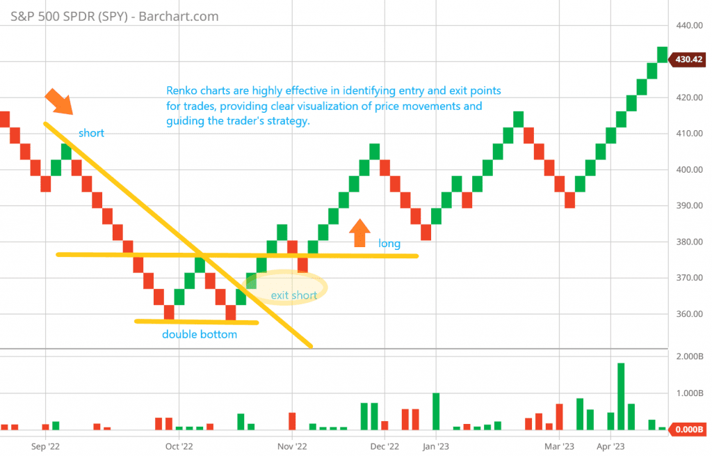
The SP 500, for example, was under pressure and ultimately broke above the trendline, offering a buying opportunity or closing a short position.
Renko chart support and resistance lines and trendlines are part of the Renko trading strategy to produce Buy Sell Signals

💡 Pro Tip:
When price breaks through a resistance line, it often becomes new support. This “flip” is one of the best signals Renko charts can offer for riding trends.


Chart Patterns and Strategies. Enhancing Trading Insight

📊 Renko Chart Buy and Sell Signals: Patterns That Matter

Once your Renko chart is set up, it’s time to look for patterns that can signal when to buy or sell. These patterns help you spot potential reversals, breakouts, or trend continuations without the noise you’d get from traditional charts.

Here are some of the most useful ones:


🔻 Double Tops & M Patterns (Bearish Reversal)

When you see a Renko chart form a double top—like the letter M—that often signals a potential sell opportunity. It shows price tried to go higher twice but failed, suggesting bearish pressure.

double top on Renko charts
Many traders utilize the double top chart pattern to anticipate trend reversals. When prices fall below the "neckline," the dip between the two peaks, this is seen as confirmation of the reversal pattern.
Double tops are a common chart pattern used to anticipate trend reversals. To confirm the reversal pattern, the price must fall below the “neckline,” the trough between the two peaks.

🔺 Double Bottoms & W Patterns (Bullish Reversal)

A W pattern shows price hit a low, bounced, then retested the low but held—hinting at a potential buy setup. These are common signals for an incoming upward trend.

double bottom on a Renko chart

🧠 Head and Shoulders

Yes, they show up on Renko charts too! The classic head and shoulders pattern is another reversal sign, especially when combined with volume or momentum indicators.


🛠️ How to Use These Patterns

  • Combine with support and resistance levels to filter out weak signals.
  • Wait for confirmation bricks (e.g., a new brick forming in your trade direction).
  • Always set a stop-loss just beyond the recent high or low for safety.

💡 Pro Tip:
Patterns work best when brick sizes are properly tuned. A too-small brick may create noise, while one too large might hide early signals.


✅ Summary:

Renko chart patterns are simple but powerful. Master just a few (like W/M or head and shoulders), and you’ll start seeing clearer signals than most traders using candlesticks.

Renko Chart Patterns

Pattern Details Example Pros Cons
W Pattern (Double Bottom) Anticipates trend reversal when price forms two troughs in a ‘W’ shape. Price of Stock A shows two troughs forming a ‘W’ pattern. – Indicates potential shift from bearish to bullish sentiment.
– Points to buying interest preventing further decline.
– False signals can occur in volatile markets.
M Pattern (Double Top) Suggests trend reversal when price creates two peaks resembling an ‘M’ shape. Stock B’s price forms two peaks forming an ‘M’ pattern. – Alerts potential transition from bullish to bearish momentum.
– Highlights resistance level inhibiting further rise.
– False signals can occur, especially in volatile markets.
Head and Shoulders Pattern Indicates bearish reversal with three peaks: a higher head between two lower shoulders. Stock C’s price demonstrates a Head and Shoulders pattern. – Strong predictor of impending bearish trend reversal.
– Reflects seller influence gaining traction.
– Not all patterns lead to significant reversals.
Inverse Head and Shoulders Pattern Suggests bullish reversal with three troughs: a lower head between two higher shoulders. Stock D’s price forms an Inverse Head and Shoulders pattern. – Signals potential shift from bearish to bullish sentiment.
– Indicates growing buyer enthusiasm.
– Not all patterns lead to strong uptrends.

Mastering Renko Charts Technical Analysis: A Comprehensive Guide


Effective Renko Chart Strategies. Learn how to use Renko charts for profitable trading

Implementing Effective Renko Chart Strategies

Crafting successful trading strategies with Renko charts involves a thoughtful blend of pattern recognition, trendline analysis, and utilization of support and resistance levels. These strategies empower traders to make informed decisions and navigate the complexities of the market with confidence. Here, we outline practical steps for trade management, strategies for loss mitigation, and methods for profit optimization.

Aspect Details Example Pros Cons
Pattern Recognition and Analysis Identifying patterns like W Pattern, M Pattern, Head and Shoulders, Inverse Head and Shoulders. W Pattern indicates potential trend reversal in Company ABC’s stock. Precise signals for potential trend reversals. Patterns may not always guarantee accurate predictions.
Leveraging Trendlines and Support/Resistance Using trendlines, support, and resistance to pinpoint entry and exit points. Ascending trendline and support level in Company XYZ’s stock. Enhanced precision in trading decisions. Market volatility can lead to false breakouts.
Practical Trade Management Setting stop-loss levels, adjusting positions based on evolving trends. Using Inverse Head and Shoulders pattern for trade management. Effective risk management and trade adjustment. Overadjustment can result in missed opportunities.
Strategies for Loss Mitigation and Profit Optimization Utilizing support/resistance for stop-loss orders, employing trailing stop orders. Setting stop-loss below resistance-turned-support in Company DEF’s stock. Limiting losses and securing profits with strategic orders. Trailing stops might lead to premature exits in volatile markets.

Pattern Recognition and Analysis

The cornerstone of a robust Renko chart strategy lies in pattern recognition. Renko charts, with their emphasis on significant price movements, offer a unique vantage point for identifying patterns that might not be as apparent on traditional charts. Patterns like the W Pattern (Double Bottom), M Pattern (Double Top), Head and Shoulders, and Inverse Head and Shoulders can be potent signals for potential trend reversals.

For instance, let’s consider an example involving a W Pattern. Assume Company ABC’s stock has experienced a downtrend, forming two successive troughs with a higher one in the middle. This W Pattern signifies that sellers attempted to drive the price lower but were met with strong buying interest. A break above the pattern’s neckline could indicate an impending upward trend, providing traders with a valuable buy signal.

The triple bottom for Tesla stock below $600 represents a good buying opportunity.
Tesla’s triple bottoms created a buy opportunity below $600.

Leveraging Trendlines and Support/Resistance

Trendlines and support/resistance levels are invaluable tools for entry and exit points. By connecting highs or lows on Renko charts, traders can identify trends and potential turning points. For instance, an ascending trendline formed by linking successive higher lows indicates an uptrend, while a descending trendline suggests a downtrend. Combining these trendlines with support and resistance levels enhances the precision of trading decisions.

Imagine Company XYZ’s stock has displayed an ascending trendline on a Renko chart, indicating an uptrend. Simultaneously, a significant support level has been established at a particular price point. If the stock’s price approaches this support level and aligns with the trendline, it could present an opportune moment to initiate a long position, leveraging the confluence of trend and support.

Through the beginning of 2021, the Exxon Mobile chart displays a very classic W pattern formation. Since then, everyone is aware that Exxon Mobile's stock price has exploded upward.
Through the beginning of 2021, the price chart for Exxon Mobile features a highly traditional illustration of a strong W pattern formation. We are all aware that ever since then, the price of Exxon Mobile shares has skyrocketed.

Practical Trade Management

Renko chart analysis doesn’t stop at pattern identification and entry points; practical trade management is crucial for success. Determine the appropriate stop-loss levels based on the Renko chart’s patterns and support/resistance zones. Adjust your positions according to the evolving trends and price movements to mitigate potential losses.

For instance, let’s say you’ve entered a trade based on an Inverse Head and Shoulders pattern. The neckline serves as your support level, and you’ve set your stop-loss slightly below this level to account for potential fluctuations. As the trade progresses and the stock’s price surges, consider trailing your stop-loss to protect your gains while still allowing room for upward movement.

BP has fallen below the significant support line at $37. At $22 it formed a W pattern, but the rebound failed. After breaking below the W pattern support of $22, the share price fell to $15 before recovering.
BP has fallen below the $37 support level. There was an attempt at a rebound when it created a W pattern at $22, but it failed. A W pattern support level of $22 was breached, and the price dropped to $15 before recovering.

Strategies for Loss Mitigation and Profit Optimization

Risk management is paramount in any trading strategy. Renko charts offer insights that can be instrumental in mitigating losses. By relying on established support and resistance levels, you can set stop-loss orders more strategically. Additionally, employing trailing stop orders that adjust as the price moves in your favor can help secure profits while allowing room for potential gains.

Let’s consider a scenario involving Company DEF’s stock. Using Renko charts, you’ve identified a strong resistance level that aligns with a recent peak. As you enter a short position, you set your stop-loss order just above this resistance-turned-support level. If the stock’s price breaks through this level, your trade is automatically exited, limiting potential losses.

In conclusion, Renko chart strategies revolve around insightful pattern recognition, effective use of trendlines, and careful consideration of support and resistance levels. By implementing practical trade management techniques and employing strategies for loss mitigation and profit optimization, traders can leverage Renko charts’ unique attributes to navigate the markets with precision and confidence.

The chart depicts how we decided to purchase Johnson and Johnson stock. In the event that the shares were not sold at $180, how would the stop-loss strategy prevent further investment losses?

Comparing Renko, Candlestick, and Heiken Ashi Charts

When it comes to analyzing market trends and making informed trading decisions, different chart types offer distinct advantages. In this section, we’ll explore how Renko charts stand out in comparison to two other popular chart types: Candlestick and Heiken Ashi.

Chart Type Details Example Pros Cons
Renko Charts Emphasizes price movements over time intervals by using bricks of fixed value. Analyze a Renko chart for a forex pair over a month.
  • Clear visualization of trends.
  • Minimized noise and fluctuations.
  • Accurate trend-following decisions.
  • May overlook minor price details.
  • Less suitable for short-term trading.
Candlestick Charts Displays detailed price movements within specific time intervals using candlestick patterns. Analyze a candlestick chart for a stock over a week.
  • Provides intricate price information.
  • Useful for various trading strategies.
  • May overwhelm with excessive details.
  • Short-term noise can be challenging to filter.
Heiken Ashi Charts Smooths out price movements by calculating average price within time frames. Analyze a Heiken Ashi chart for a cryptocurrency.
  • Enhanced trend identification.
  • Minimized impact of short-term fluctuations.
  • May lack fine details.
  • Loss of real-time price information.

Candlestick Charts: Unveiling Fine Details and Precise Timing

Candlestick charts have long been a staple in the world of technical analysis. These charts provide intricate details about price movements within specific time intervals. Each candlestick on the chart represents a defined time period, such as an hour or a day, and includes information about the opening, closing, high, and low prices.

Example:
Imagine you’re analyzing a candlestick chart for a particular stock over a week. Each candlestick represents a single day of trading. You notice that a series of candlesticks with long upper shadows followed by short bodies and lower shadows signals potential price reversals. These patterns, known as “shooting stars,” often indicate a shift from bullish to bearish sentiment.

GOOGL (Google Class A) Candlesticks chart

Heiken Ashi Charts: Smoothing Out Price Movements

Heiken Ashi charts are designed to provide traders with a clearer representation of trends by smoothing out the noise caused by volatile price fluctuations. These charts utilize a specific calculation method to generate candlestick patterns that focus on the average price movement within a given time frame.

Example:
Suppose you’re analyzing a Heiken Ashi chart for a cryptocurrency. The chart showcases a series of candlesticks with minimal wicks and smooth transitions between bullish and bearish trends. This visual simplicity aids in identifying the dominant trend direction and minimizing the impact of short-term price fluctuations.

GOOGL (Google Class A) Heikin Ashi chart

Renko Charts: Excel in Trend-Following

Renko charts offer a unique approach by prioritizing price movements over time intervals. Each brick on a Renko chart represents a predefined price increment, and new bricks are only added when significant price changes occur. This approach eliminates the noise of minor price fluctuations and provides a clear visualization of the underlying trends.

Example:
Consider analyzing a Renko chart for a forex pair over a month. The chart consists of bricks that represent price movements of a set value, regardless of the time elapsed. You observe that the Renko chart showcases distinct trends more prominently than a traditional candlestick chart. This enhanced clarity aids in making accurate trend-following decisions.

GOOGL (Google Class A) Renko chart

Conclusion: Choosing the Right Chart Type

Selecting the appropriate chart type depends on your trading style, goals, and the level of detail you seek. Candlestick charts offer fine-grained insights into price movements and are suitable for various trading strategies. Heiken Ashi charts provide a smoothed perspective, aiding in trend identification. However, if trend-following is your primary objective, Renko charts excel by emphasizing significant price changes and minimizing noise.

Renko vs. Candlestick Charts: Which is Better for Trading?

Understanding Renko Chart Patterns. Enhance Your Trading Insight

Understanding Renko Chart Patterns for Enhanced Trading Insight

Renko chart patterns provide traders with a distinctive perspective on market trends, prioritizing price changes as the focal point. By highlighting significant movements, Renko charts offer a valuable tool for traders to refine their strategies and make more informed decisions.

Example 1:
Suppose you’re analyzing the price movement of Stock A using Renko charts. Instead of being constrained by fixed time intervals, Renko charts focus solely on price shifts. For instance, a Renko brick might represent a $5 price movement. This means that if Stock A’s price increases by $20 within a specific timeframe, four bricks will be added to the chart. By eliminating time-based fluctuations, Renko charts reveal substantial price trends that might be obscured in other charting methods.

Example 2:
Imagine you’re a forex trader assessing the EUR/USD currency pair’s performance. Renko charts can help you better visualize and interpret trends. For instance, if the brick size is set at 20 pips, and the currency pair experiences a series of upward movements of 60 pips, three bricks will be added to the chart. This streamlines the focus on consistent price movements, making it easier to identify trends and patterns.

Renko charts offer a versatile tool for traders seeking to better understand price trends without the interference of time-based fluctuations. By integrating Renko chart patterns with support, resistance, and trendlines, traders can unlock valuable insights and construct effective trading strategies.

Conclusion

In the realm of financial markets, where precision and informed decisions are paramount, Renko chart patterns emerge as a potent asset. Their emphasis on significant price changes and the ability to filter out noise make them an indispensable tool for traders seeking an edge.

Renko chart patterns hold the potential to unlock deeper insights into market trends, enabling traders to navigate the complex landscape with greater confidence. By integrating these patterns with established support, resistance, and trendline strategies, traders can harness a holistic approach that transcends traditional methods.

In the pursuit of optimal trading success, Renko chart patterns provide an exceptional avenue for pattern recognition and trend prediction. Their role in unveiling potential reversals and highlighting essential price movements is pivotal in cultivating a comprehensive trading strategy.

As you navigate the intricate world of trading, consider the strategic integration of Renko chart patterns as a cornerstone of your analytical toolkit. By mastering their nuances and aligning them with your trading objectives, you can harness the power of data-driven insights to make well-informed decisions.

In essence, Renko chart patterns illuminate a path toward more precise, confident, and profitable trading endeavors. Incorporate them judiciously, and witness how these patterns can transform your trading journey into one marked by enhanced precision and superior outcomes.

🎯 Want more Renko strategies?
Explore our full collection of Renko trading tutorials, advanced setups, and free tools to sharpen your edge.

Visit Our Renko Hub

How To Use Renko Charts for Stock Trading

Key Takeways

Renko charts simplify support and resistance detection.
Filter out price movements less than the brick size with Renko charts.
Utilize Renko charts in combination with RSI for effective analysis.
Renko charts exhibit similar patterns to candlestick charts.
Identify trendlines and chart patterns for informed trading decisions.
Use Renko chart pattern scanner for convenient trading opportunities.

Advantages of Renko Charts

The most significant advantage of using Renko charts for stock trading is their simplicity. Renko charts are useful for stock trading because they make determining support and resistance levels very simple. Any price movements less than the brick size are filtered out by Renko charts. As a result, we are able to see the trend more clearly.

Since Renko charts are all about how prices move, they can be used on their own to make trading decisions. Once a support or resistance level has been broken, a buy or sell order and, if needed, a stop-loss order can be set. Using Renko charts, you can easily ride out price trends. You shouldn’t exit until you see a reversal. Normally, it is a confirmed box of the opposite color.

Some traders like to use the chart in conjunction with the RSI to forecast the market’s peak or bottom. Typically, they seek price and RSI divergence on the Renko charts. However, when a trend is very strong, the divergence may not be precise. Because the divergence signal emerges too early in the trend, the trade fails.

Ways to Use Renko Charts for Stock Trading

Support and Resistance

Renko charts make it very simple to detect support, resistance, and trendlines. A trade action might be initiated if the support, resistance, or trendline is violated.

An example of a double bottom formation with a purchase signal on a chart is shown below.

Renko charts simplify the detection of support, resistance, and trendlines, allowing traders to initiate trades if these boundaries are breached.

Use Renko Chart Price and RSI Divergence

The RSI might be a useful indicator to utilize in conjunction with Renko Charts, but it might generate a buy or sell signal far too early in a strong trend.

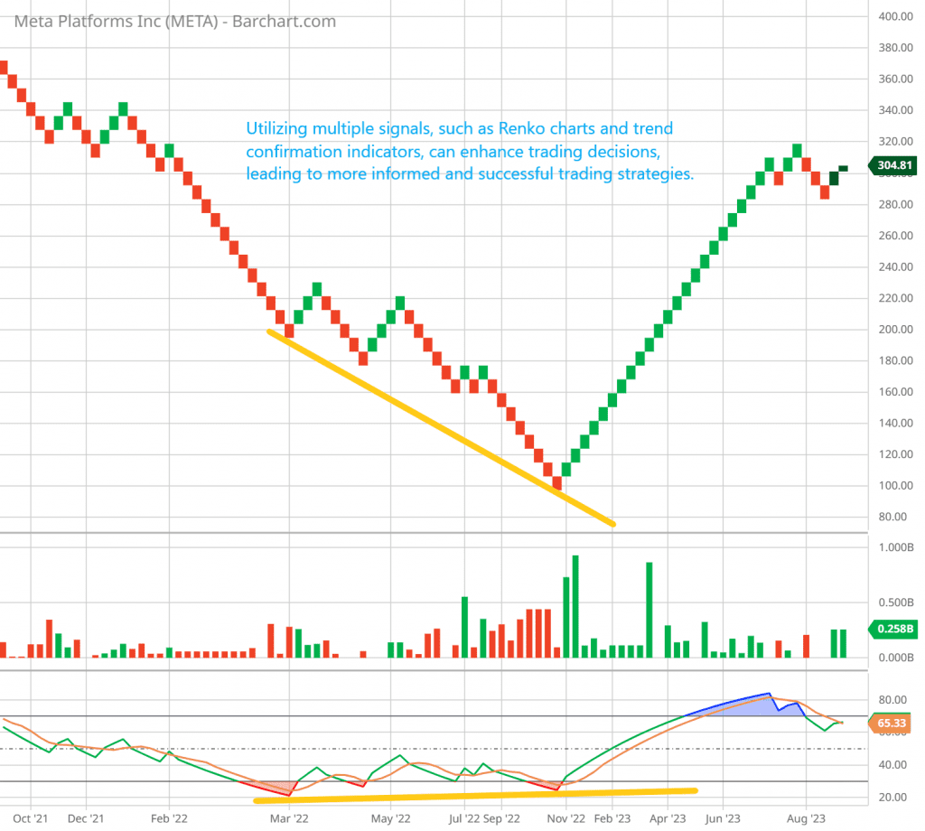
The following is an illustration of the divergence between stock prices and the relative strength index (RSI). However, while divergence is a respectable technical analysis chart pattern, it is not always 100 percent accurate. On the left-hand side of the chart, you can see that the stock price has continued to rise despite the fact that the RSI has reached lower highs.

In this scenario, it is clear that the divergence pattern between the stock price and the technical indicator cannot be the primary factor influencing the decision-making process. Support, resistance, and trend lines should all be applied to the chart as part of the decision-making process when making trading decisions.

Utilizing multiple signals, such as Renko charts and trend confirmation indicators, can enhance stock trading decisions, leading to more informed and successful trading strategies.

Chart Patterns

Renko charts exhibit the same patterns as candlestick charts, such as double tops or bottoms, head and shoulders, and triangles. Such patterns may be more apparent on a Renko chart since there are fewer small price fluctuations.

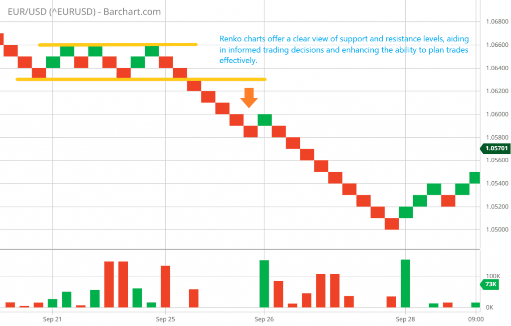
Trendlines for a Downward Trend

The downtrend in the EURUSD pair materialized with pronounced clarity as the price decisively breached the crucial support level at 1.0630. This breach signaled a notable shift in market sentiment and set the downtrend firmly in motion. The downtrend persisted, maintaining its momentum until the price eventually found a stabilizing support floor in the vicinity of 1.0500. This phase underlined the market’s persistent bearish sentiment during that period, emphasizing the significance of the breach at 1.0630 and the subsequent struggle for support.

Renko charts offer a clear view of support and resistance levels, aiding in informed trading decisions and enhancing the ability to plan trades effectively.

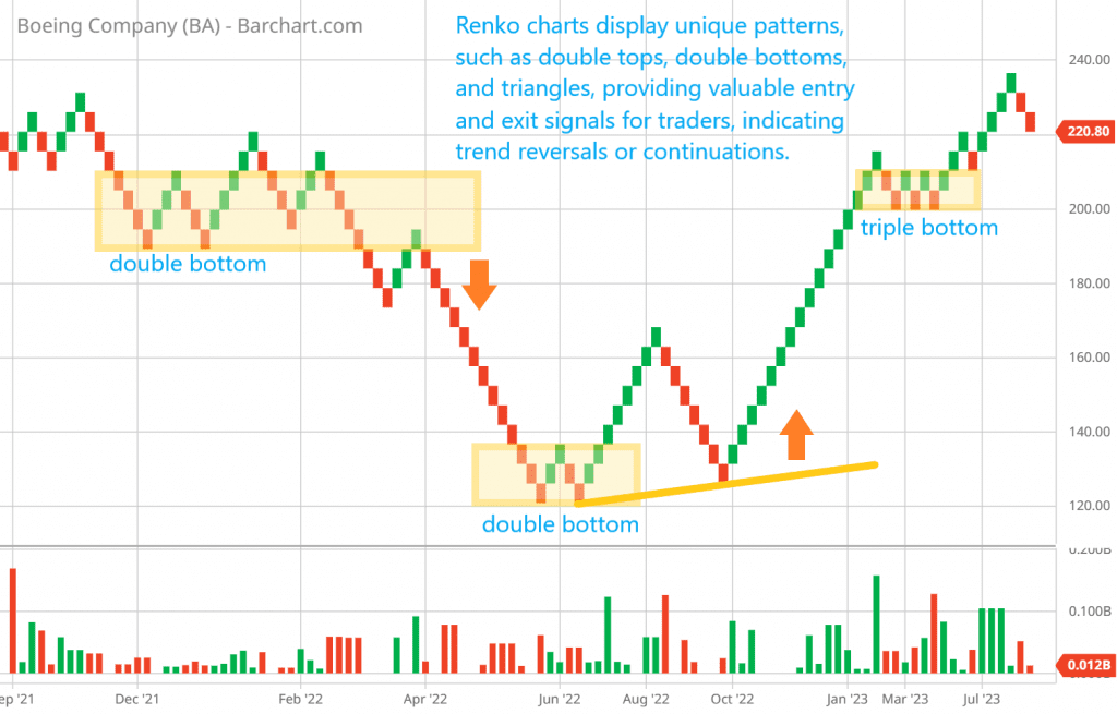
Double Bottom and Reversed Head and Shoulder Patterns

The occurrence of a double bottom at the $190 level initially seemed promising but ultimately proved to be a false signal. It prompted caution, suggesting the need for risk management strategies such as employing a stop order or implementing a protective put when the price dipped below $190, aiming to mitigate potential losses. Following this, a retest of a lower price point at $125 provided validation for the true double bottom formation around $120. Consequently, a strong purchase signal was confirmed, indicating a compelling opportunity to enter the market at this level.

Renko charts display unique patterns, such as double tops, double bottoms, and triangles, providing valuable entry and exit signals for traders, indicating trend reversals or continuations.

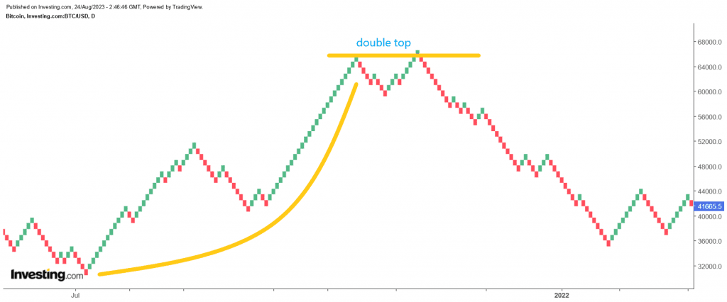
Double Top and Head and Shoulder Pattern

In a notable technical analysis of Bitcoin’s price movement, it was observed that the cryptocurrency exhibited a double top formation around the $65,000 price level. This pattern is characterized by two peaks at a similar price point, indicating a potential trend reversal. However, the critical point in this pattern was the neckline, set at approximately $59,500.

Once the price breached this critical support level, the market saw a relentless downtrend. The breach of the neckline confirmed the double top formation and triggered a sell-off, intensifying the downward momentum in Bitcoin’s price. Traders and investors closely watched this development as it marked a significant shift in the market sentiment and further highlighted the importance of technical analysis in the volatile cryptocurrency space.

Technical analysis of Bitcoin's price movement revealed a double top formation, triggering a sell-off and highlighting the importance of technical analysis in volatile cryptocurrency markets.

Renko Charts Pattern Scanner

This website provides a free Renko chart pattern scanner to make it easier for traders to find trading opportunities.