What is a Renko chart? It’s a unique type of price chart that filters out time and focuses purely on price movement. Renko charts are built using “bricks” instead of candlesticks, making them ideal for spotting trends and reversals with less noise. Investopedia offers a great overview of how they compare to other chart types. This guide is designed to help beginners understand how Renko charts work—from setup to strategy. If you’re exploring Renko charts for beginners, you’re in the right place. Once you understand the basics, the next step is learning how Renko brick size, wicks, and reversal confirmation affect signal quality and decision-making.
- Renko charts show price movement only—no time axis involved.
- A new brick forms when price moves by a set amount, not every minute or hour.
- Fixed or ATR-based brick sizes can be used based on your strategy.
- Patterns like W, M, and breakouts help identify high-probability trades.
- Renko helps reduce noise, making trends easier to spot.
Table of Contents
🎥 Video Tutorial
Watch this step-by-step guide to see how Renko charts work—and how you can use them to trade smarter.
👇 Keep scrolling for the full guide—we’ll dive deeper into brick sizes, setups, and real examples.
🔍 What Is a Renko Chart? A Beginner’s Overview
Instead of using time like candlestick charts do, Renko charts focus only on price movement. They build a new “brick” only when the price moves by a set amount—so you can easily spot trends and reversals without the noise.
🧱 How Renko Bricks Work:
- A green (up) brick forms when the price rises by your chosen amount.
- A red (down) brick forms when it drops by that same amount.
- If the price doesn’t move enough? No new brick. No clutter.
🎯 Why Use Renko Charts?
- ✅ Filter out noise and focus on major price moves
- ✅ Spot support/resistance levels more clearly
- ✅ Great for traders who want cleaner charts and stronger signals
Think of Renko charts as a way to declutter your decision-making—they strip away the timing noise and show you only what matters: price direction.
📏 What Is a Renko Chart and How Does It Work? (Simple Version)
Renko charts are made of bricks—not time-based candles. A new brick forms only when the price moves a certain amount, called the brick size.
Let’s say your brick size is set to $2:
- If the price rises $2 from the last brick’s close, a green (up) brick is added.
- If the price falls $2, a red (down) brick is added.
- If price moves less than $2? Nothing happens.
No matter how much time passes—1 minute or 5 hours—no brick forms until price hits the next threshold.
This is what makes Renko charts so clean and easy to read.
New to Renko? I recommend starting with my step-by-step Renko charts guide, which walks through the complete process from understanding bricks to building and testing trading strategies.
💡 Quick Example:
If the price goes from $100 to $104, and your brick size is $2:
- You’ll see two green bricks
- If price drops to $102 after that, you’ll get one red brick
- If it stays at $102 for hours, the chart doesn’t change
🧱 Brick Size Selection: Fixed vs ATR
Choosing the right brick size is a big part of using Renko charts effectively.
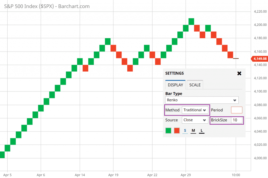
🔹 Fixed Brick Size
You pick a number (e.g., $1 or $5), and that’s it. Great for simplicity and consistency.
Best for: Beginners and slower-moving assets.

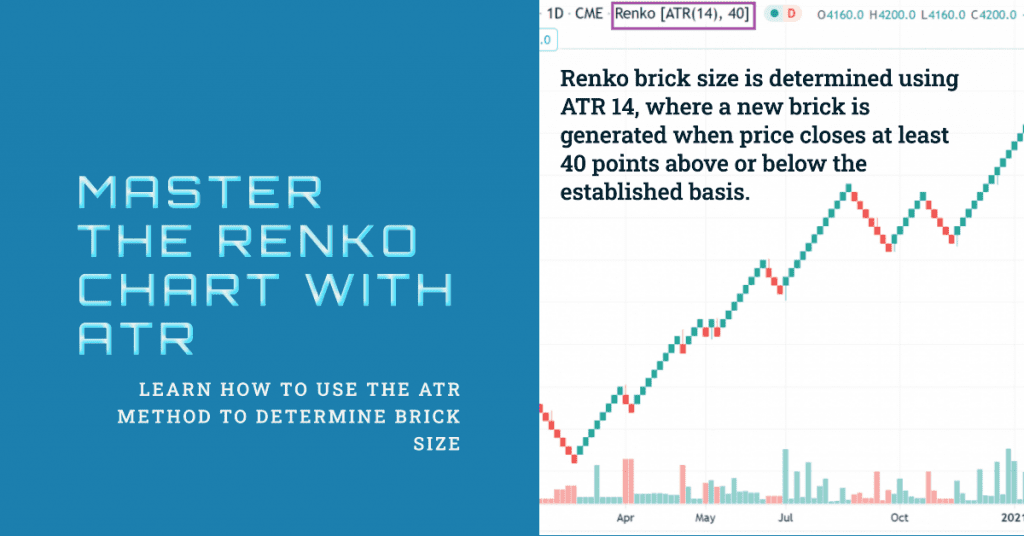
🔹 ATR-Based Brick Size
This method uses Average True Range (ATR) to adjust the brick size dynamically based on market volatility. When the market moves more, your bricks get bigger—filtering out even more noise.
Best for: Active traders and volatile markets like crypto or intraday forex.

💡 Pro Tip:
If you’re unsure where to start, try using ATR(14) to calculate your brick size automatically. It adapts and helps balance signal clarity with responsiveness.
🕒 What’s the Best Timeframe for Renko Charts?
Here’s the cool part: Renko charts don’t care about time—they’re all about price.
That means you won’t see hourly, daily, or weekly candles. Instead, a new Renko brick forms only when the price moves a specific amount, no matter how long it takes.
But traders still ask: “What’s the best timeframe to use with Renko?” The answer depends on how you trade.
🧠 Match the Brick Size to Your Strategy
Even though Renko doesn’t use time, your trading style and goals still matter when choosing how to use it.
🔹 For Intraday Traders:
- Use smaller brick sizes (e.g., 0.5% or ATR on short-term charts)
- Good for spotting quick trends and fast reversals
🔹 For Swing Traders:
- Use moderate brick sizes (e.g., 1–2% or ATR on daily data)
- Filters out market noise and shows clean trend direction
🔹 For Long-Term Investors:
- Use larger brick sizes or weekly ATR
- Focus on major market moves and trend structure
💡 Pro Tip:
Don’t confuse brick size with timeframe. You can apply Renko logic to price data from any period—but the brick size determines how often the chart moves.
💬 How I Use Renko Charts in My Own Trading
I’ve tested a lot of chart types over the years, but Renko charts are one of the few that actually made me slow down—and see price action more clearly.

🔹 My Setup
I typically use ATR-based brick sizes, especially on daily charts. This keeps things dynamic and adjusts for market conditions. It helps filter out false breakouts and smooths the overall trend, which is what I really want when planning trades.
For example, I often pair Renko charts with a moving average to confirm direction—and I mark key support and resistance zones manually. When price breaks those zones on a Renko chart, it usually signals a strong move.
If you are wondering whether Renko charts work better for stocks, forex, or crypto markets, see my detailed breakdown of the best markets for Renko charts and how different assets behave with Renko bricks.
🔹 How I Use It
- I use Renko for trend confirmation, not always for exact entries.
- It’s also a great filter tool—if the trend isn’t clear on Renko, I usually wait.
- And when I do spot a signal, it feels more “measured” than jumping on every candlestick flicker.
🧠 Why I Keep Coming Back to Renko
It helps me stay patient.
I don’t feel rushed to act on every twitch in the market. Renko bricks don’t lie—they either form or they don’t. That simplicity has helped me trade with more discipline, especially during volatile periods.
📝 Quick Summary
- Renko charts focus on price, not time—bricks form only when the price moves by a set amount.
- They help you filter out noise and see trends more clearly than candlesticks.
- You can use fixed or ATR-based brick sizes depending on your trading style.
- Common Renko patterns like W/M formations and support/resistance zones can guide your entries and exits.
- There’s no “best” timeframe—but smaller bricks suit short-term traders, while larger bricks suit swing or long-term investors.
- I personally use Renko for trend confirmation and cleaner setups, especially with ATR-based bricks on daily charts.
🏁 Final Thoughts
Renko charts might look different at first, but once you understand how they work, they can simplify your trading and give you a new level of clarity.
Whether you’re a beginner trying to cut through market noise or an experienced trader looking to refine your edge, Renko is worth exploring.
Start with simple setups, test different brick sizes, and see how this clean chart style can help you stay focused on what matters most: price movement and trend direction.
