Overview
Welcome to “How Do Renko Charts Work: A Traders Guide.” Renko charts are a dynamic and specialized tool that holds immense potential for traders seeking a deeper understanding of market trends and patterns. In this guide, we’ll embark on a journey to unravel the intricacies of Renko charts, showcasing their unique attributes and how they synergize with technical analysis principles. We’ll delve into various aspects, from chart patterns and support/resistance levels to moving averages and trend lines, all tailored to Renko’s distinct noise-filtering structure.
Table of Contents
How Do Renko Charts Work?
Renko charts offer a unique approach to visualizing price movements that differ from traditional candlestick or bar charts. They are designed to filter out market noise and emphasize price trends, making them a valuable tool for technical analysis. Let’s delve into how Renko charts work and their distinctive features.
Comparison of Renko, Candlesticks, and Heikin Ashi
| Aspect | Renko | Candlesticks | Heikin Ashi |
|---|---|---|---|
| Noise Filtering | Filters out noise, focuses on trends | Can have noise due to small price fluctuations | Reduces noise, emphasizes trends |
| Price Representation | Based on fixed price movements (bricks) | Open, high, low, close prices | Open, high, low, close prices modified for trends |
| Trend Clarity | Highly emphasizes trends with fewer distractions | Less emphasis on trends due to noise | Enhances trend visibility, reduces noise |
| Pattern Recognition | Clear visualization of patterns with reduced noise | May have false signals due to noise | Reduces false signals, highlights patterns |
| Support/Resistance | Indicates levels clearly with fewer fluctuations | May show some levels, but noise can affect accuracy | Enhances support/resistance levels’ clarity |
| Pattern Confirmation | Accurate pattern confirmations due to noise reduction | May require additional analysis for confirmation | Provides clearer pattern confirmation |
To see how these bricks generate actual trade setups, check out this guide on Renko chart buy and sell signals.
Want to try Renko charts in TOS? Here’s a detailed Thinkorswim Renko chart setup guide with step-by-step visuals.
Understanding Renko Chart Construction
Renko Bricks:
- The basic building block of Renko charts is the “brick.”
- Each brick represents a fixed price movement, regardless of time.
- Bricks can be set to a specific value, such as 1 point or $0.50.
Brick Direction:
- Bricks are drawn in two directions: upward or downward.
- An upward brick (green or white) indicates a price increase.
- A downward brick (red or black) indicates a price decrease.
Noise Reduction and Trends
Noise Filtering:
- Renko charts filter out minor price fluctuations and focus on significant movements.
- This reduces market noise, providing a clearer view of trends.
Trend Emphasis:
- Renko charts excel in showcasing trends by eliminating small price changes.
- Traders can easily identify the prevailing trend direction.
Renko removes a lot of time-based noise, but that does not mean every market becomes tradable. I keep a simple checklist for recognizing trends vs ranges, explained here: when Renko charts work best. If you are also wondering which assets tend to work best with this chart style, see my guide on the best markets for Renko charts.
Building Renko Charts Step by Step
- Choosing Brick Size:
- Select a brick size that suits your trading style and the asset’s volatility.
- Smaller brick sizes capture more price details, while larger ones offer a broader view of trends. The timeframe you analyze alongside Renko bricks can also affect how signals appear. For examples of scalping, day trading, and swing trading setups, see my guide on the best timeframe for Renko charts.
- Brick Formation:
- The chart starts with a brick’s base price.
- If the price moves up by the brick size or more, an upward brick is drawn.
- If the price moves down by the brick size or more, a downward brick is drawn.
Example of Renko Chart Construction
Imagine we’re trading Stock XYZ with a brick size of $1:
- The stock opens at $50.
- The price rises to $51, a $1 increase, leading to an upward green brick.
- The price then drops to $49, a $2 decrease, resulting in a downward red brick.
- If the price goes up to $52, a second upward green brick is formed.
Spotting Reversals and Patterns
Reversal Patterns:
- Renko charts can help identify trend reversals more clearly due to noise reduction.
- Reversal patterns like double tops or bottoms become more apparent.
Pattern Recognition:
- Chart patterns such as head and shoulders, triangles, and flags are easier to spot on Renko charts.
- Traders can make informed decisions based on these patterns.
Renko charts work by emphasizing price trends while filtering out market noise. Their construction with bricks simplifies trend identification and pattern recognition. By understanding how Renko charts function, traders can gain a powerful tool to enhance their technical analysis and make more informed trading decisions.
Calculating Renko Chart Brick Sizes and Formulas
Renko charts are a popular charting technique used in financial markets to display price movements in a visually appealing manner. The central concept of a Renko chart is the “brick” which represents a fixed price movement. The size of these bricks is crucial in determining the chart’s accuracy and usefulness. Here are several methods to calculate Renko chart brick sizes, along with their respective formulas:
- Fixed Brick Size:
- Formula: Brick Size = Fixed price increment or decrement
- Average True Range (ATR)-based Brick Size:
- Formula: Brick Size = ATR value * Scaling factor
- Scaling factor can be any value like 0.5, 1.0, etc., depending on desired sensitivity.
- Percentage Change-based Brick Size:
- Formula: Brick Size = Percentage change in price * Previous brick’s closing price
- Volatility-based Brick Size:
- Formula: Brick Size = Standard deviation of price changes over a specific period
- Adaptive Brick Size:
- Formula: Brick Size = Highest of fixed price increment, ATR-based, or percentage change-based
Renko Chart Brick Sizes and Formulas
| Method | Formula |
|---|---|
| Fixed Brick Size | Brick Size = Fixed price increment or decrement |
| ATR-based Brick Size | Brick Size = ATR value * Scaling factor |
| Percentage Change-based Brick Size | Brick Size = Percentage change in price * Previous brick’s closing price |
| Volatility-based Brick Size | Brick Size = Standard deviation of price changes over a specific period |
| Adaptive Brick Size | Brick Size = Highest of fixed price increment, ATR-based, or percentage change-based |

Renko Charts Technical Analysis
Comparison of Different Technical Analysis Methods
| Aspect | Support and Resistance | Moving Averages | Trend Lines | Chart Patterns |
|---|---|---|---|---|
| Objective | Identify price levels where trends may reverse or continue | Smooth price data to identify trend direction | Visualize trend direction and potential reversal points | Identify recurring price patterns for trend prediction |
| Method | Horizontal lines at key price levels | Average of past prices over a specified period | Draw lines connecting price highs or lows | Identify formations like head and shoulders, triangles, etc. |
| Usage | Confirming entry/exit points, stop loss, take profit | Identifying trend direction, crossovers, support/resistance | Confirming trends, spotting potential reversals | Predicting trend continuation or reversal based on patterns |
| Advantages | Clear decision points for traders, simple to apply | Smooths price data, filters noise, easy to interpret | Visually highlights trends, applicable to various assets | Offers insights into market psychology, adaptable to timeframes |
| Limitations | Can be subjective, false breakouts can occur | May lag behind rapidly changing trends | Can be prone to subjective interpretation | Patterns might fail or give false signals, needs confirmation |
Introduction to Chart Patterns
Chart patterns are visual representations of price movements that often repeat in financial markets. They provide traders and analysts with insights into potential future price movements based on historical patterns. Renko charts, known for their ability to filter out noise and highlight trends, offer a unique perspective on chart patterns. Here, we’ll explore various chart patterns that can be identified and utilized effectively on Renko charts.
Comparison of Chart Patterns on Renko Charts
| Chart Pattern | Explanation | How to Identify on Renko Charts | Example and Illustration |
|---|---|---|---|
| Head and Shoulders | Reversal pattern with three peaks: central peak higher than the others. | Identify higher peak between two lower peaks. | Illustration of a head and shoulders pattern on Renko chart. |
| Triangles | Consolidation pattern with decreasing price volatility. | Draw converging trendlines connecting highs and lows. | Renko chart example of a symmetrical triangle. |
| Double Tops and Bottoms | Reversal pattern with two consecutive peaks or troughs. | Identify two highs or lows at a similar price level. | Case study of a double bottom pattern on Renko chart. |
| Rising and Falling Wedges | Continuation pattern with narrowing price range. | Identify converging trendlines with higher highs and lows (rising) or lower highs and lows (falling). | Renko chart illustration of a rising wedge pattern. |
| Bullish and Bearish Pennants | Short-term continuation pattern resembling a small symmetrical triangle. | Spot a small symmetrical triangle after a strong price move. | Example of a bullish pennant on Renko chart. |
| Ascending and Descending Triangles | Consolidation pattern with one horizontal trendline and one upward (ascending) or downward (descending) trendline. | Identify horizontal and sloping trendlines. | Renko chart example of an ascending triangle. |
| Inverted Head and Shoulders | Reversal pattern with three troughs: central trough lower than the others. | Identify lower trough between two higher troughs. | Real-world example and implications on Renko chart. |
| Flag Patterns | Short-term continuation pattern resembling a small rectangular flag. | Identify a small rectangular shape after a sharp price move. | Renko chart illustration of a flag pattern. |
| Cup and Handle Pattern | Reversal or continuation pattern resembling a teacup and handle. | Spot a rounded bottom followed by a consolidation (the handle). | Comparative analysis of cup and handle on Renko and other charts. |
| Gaps and Breakaway Patterns | Patterns formed by gaps and strong price moves. | Identify gaps and price movements that signal potential breakaways. | Tips for confidently trading complex Renko-based patterns. |
Head and Shoulders Pattern on Renko Charts
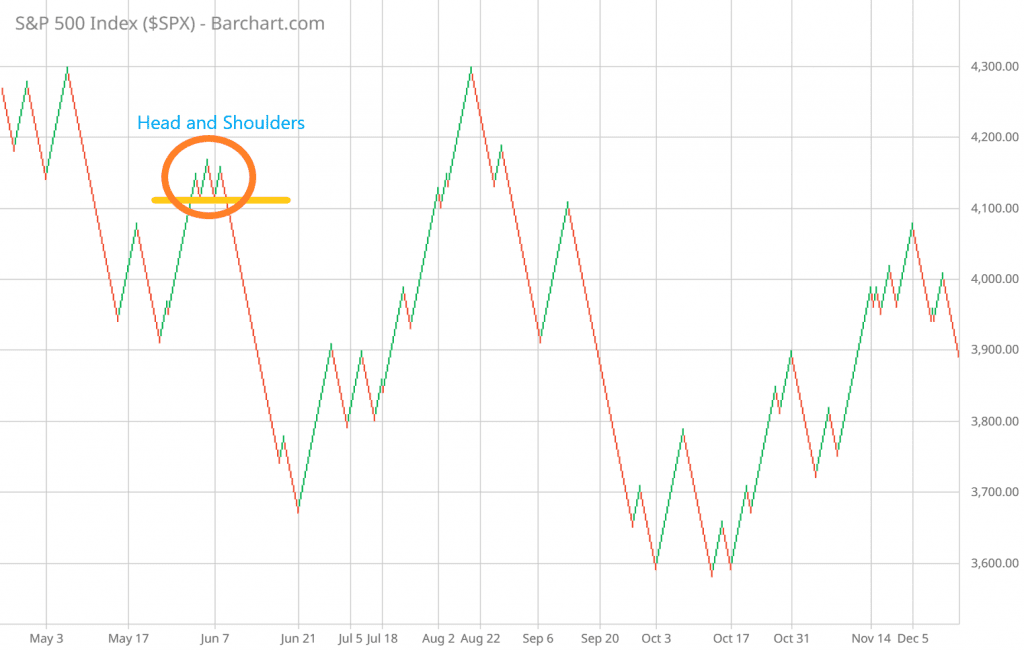
The head and shoulders pattern is a widely recognized reversal pattern characterized by three peaks: a higher peak (head) flanked by two lower peaks (shoulders) on either side. This pattern indicates a potential trend reversal from bullish to bearish or vice versa. On Renko charts, the head and shoulders pattern stands out due to its distinct structure and less noise.
Explanation of the Pattern
- Left Shoulder: The left shoulder represents an initial high followed by a temporary decline in price.
- Head: The head is the highest peak, signaling a strong bullish trend. It’s followed by a retracement that usually doesn’t reach the level of the left shoulder.
- Right Shoulder: The right shoulder is the third peak, similar in height to the left shoulder. It marks another retracement after the head.
- Neckline: The neckline connects the lows of the two troughs that form between the shoulders and the head.
How to Identify on Renko Charts
To identify a head and shoulders pattern on Renko charts:
- Look for a clear sequence of higher highs (head) and lower highs (shoulders).
- Focus on the neckline, which connects the lows between the peaks.
- The neckline acts as a support level. A break below it confirms the pattern.
Example and Illustration
Imagine a Renko chart of XYZ stock where you spot a head and shoulders pattern:
- Left Shoulder: Price reaches $50 and then retraces to $45.
- Head: The price rallies to $60, forming the head.
- Right Shoulder: The price retraces to $55.
- Neckline Break: When the price drops below the neckline at $45, the pattern is confirmed.
This head and shoulders pattern on the Renko chart suggests a potential reversal from a bullish trend to a bearish trend.
By understanding and recognizing these patterns on Renko charts, traders can make informed decisions about potential trend reversals and entry/exit points using Renko charts technical analysis.
Triangles on Renko Charts
Triangles are continuation patterns that represent periods of consolidation before the price breaks out in the direction of the prevailing trend. On Renko charts, triangles offer distinct advantages due to their clean and simplified representation of price movement.
Types of Triangles
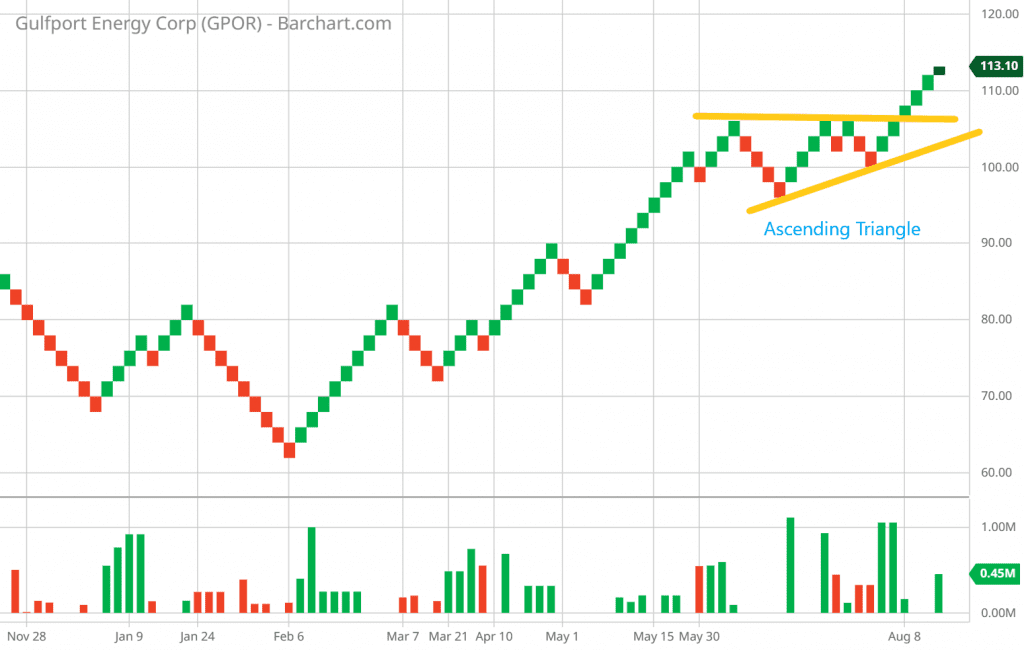
- Ascending Triangle: This pattern has a flat top resistance line and a rising support line. It suggests a potential bullish breakout.
- Descending Triangle: Here, a declining resistance line meets a flat support line. It implies a possible bearish breakout.
- Symmetrical Triangle: Both the resistance and support lines converge, forming a symmetrical triangle. This indicates potential price volatility and a breakout in either direction.
Spotting Triangles on Renko Charts
To identify triangles on Renko charts:
- Draw trendlines connecting the highs and lows that form the converging lines of the triangle.
- Observe decreasing price fluctuations within the triangle as it forms.
Real-World Example
Consider a Renko chart showing an ascending triangle:
- Resistance line at $70
- Rising support line at $65
- Price consistently making higher lows
As the price approaches the apex of the triangle, traders anticipate a bullish breakout above the $70 resistance, leading to a potential uptrend continuation.
Understanding these triangle patterns on Renko charts empowers traders in Renko charts technical analysis to anticipate breakout directions and capitalize on ensuing trends.
Double Tops and Bottoms on Renko Charts
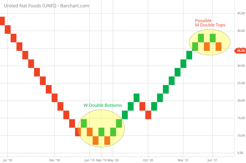
Double tops and bottoms are reversal patterns that indicate a potential trend change. They consist of two price peaks (double top) or troughs (double bottom) that are approximately at the same level. On Renko charts, these patterns are easier to identify due to the reduction of minor fluctuations.
Defining the Pattern
- Double Top: Formed after an uptrend, it signals a potential shift to a bearish trend. It occurs when the price reaches a resistance level twice but fails to break through.
- Double Bottom: Developing after a downtrend, it suggests a possible shift to a bullish trend. It arises when the price hits a support level twice but fails to drop further.
Recognizing the Pattern’s Significance on Renko Charts
Identifying double tops and bottoms on Renko charts involves:
- Observing the two peaks or troughs at nearly the same price level.
- Confirming the pattern with a break below (double top) or above (double bottom) the interim support/resistance level.
Case Study
Imagine a Renko chart displaying a double top:
- First Peak: Price hits $75, followed by a minor decline.
- Second Peak: Price rallies again to $75 but fails to surpass it significantly.
- Breakout Confirmation: A drop below the interim support at $70 confirms the double top pattern, indicating a potential trend reversal.
These patterns can be particularly powerful on Renko charts, where the noise is filtered out, making the peaks and troughs more distinct in the context of Renko charts technical analysis.
Rising and Falling Wedges on Renko Charts
Wedge patterns are another set of significant chart patterns that traders can identify and use on Renko charts. These patterns signal potential trend continuation after a consolidation phase. Rising wedges and falling wedges provide insights into future price movements.
Explaining Rising and Falling Wedge Patterns
- Rising Wedge: This pattern features converging trendlines with the lower trendline steeper than the upper trendline. It suggests a potential bearish reversal.
- Falling Wedge: In contrast, a falling wedge pattern has converging trendlines with the upper trendline steeper. It indicates a possible bullish reversal.
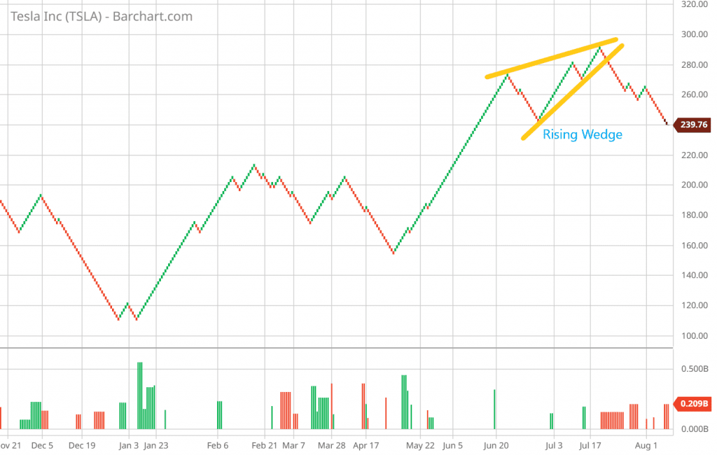
Identifying Wedges on Renko Charts
To identify wedge patterns on Renko charts:
- Draw trendlines connecting the highs and lows that form the converging lines.
- Observe the narrowing price range as the pattern develops.
Analyzing Breakout Directions and Potential Price Targets
- Rising Wedge Breakout: A bearish breakout occurs when the price drops below the lower trendline. Traders might anticipate a downtrend continuation.
- Falling Wedge Breakout: A bullish breakout happens when the price rises above the upper trendline. This can indicate an uptrend continuation.
Wedge patterns can be particularly effective on Renko charts due to their tendency to highlight meaningful price movements and trends.
Bullish and Bearish Pennants on Renko Charts
Pennant patterns are short-term continuation patterns that form after a strong price movement, followed by a brief consolidation. These patterns resemble a small symmetrical triangle, where the price range narrows as it consolidates. On Renko charts, pennants offer traders a clear view of price movement and consolidation phases.
Defining Bullish and Bearish Pennant Patterns
- Bullish Pennant: Forming after an upward price movement, this pattern features a small symmetrical triangle. It indicates a potential continuation of the bullish trend after the consolidation.
- Bearish Pennant: Developing after a downward price movement, the bearish pennant also involves a symmetrical triangle. It suggests a possible continuation of the bearish trend.
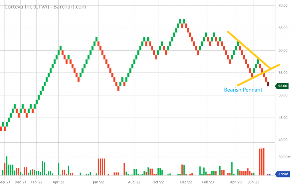
Recognizing Pennants on Renko Charts
To identify pennant patterns on Renko charts:
- Look for a strong price movement (flagpole) followed by a narrowing consolidation phase (pennant).
- Observe the reduction in price fluctuations as the pennant forms.
Utilizing Pennant Breakouts for Trading Decisions
- Bullish Pennant Breakout: A breakout above the upper trendline of the pennant suggests a continuation of the bullish trend. Traders might consider entering long positions.
- Bearish Pennant Breakout: Conversely, a breakout below the lower trendline of the pennant implies a continuation of the bearish trend. Traders may consider short positions.
Pennant patterns on Renko charts offer traders an opportunity to capitalize on short-term price movements following consolidations.
Ascending and Descending Triangles on Renko Charts
Ascending and descending triangles are continuation patterns that provide insights into potential trend continuation. These patterns are characterized by a flat trendline (support or resistance) and a trendline that slopes in the opposite direction. On Renko charts, these patterns are clearer and can be analyzed with precision.
Understanding Ascending and Descending Triangle Patterns
- Ascending Triangle: In this pattern, the horizontal resistance level remains constant, while the ascending support line suggests increasing buying pressure. A bullish breakout is anticipated.
- Descending Triangle: Here, the descending resistance level persists, indicating potential selling pressure. The flat support line suggests a potential bearish breakout.
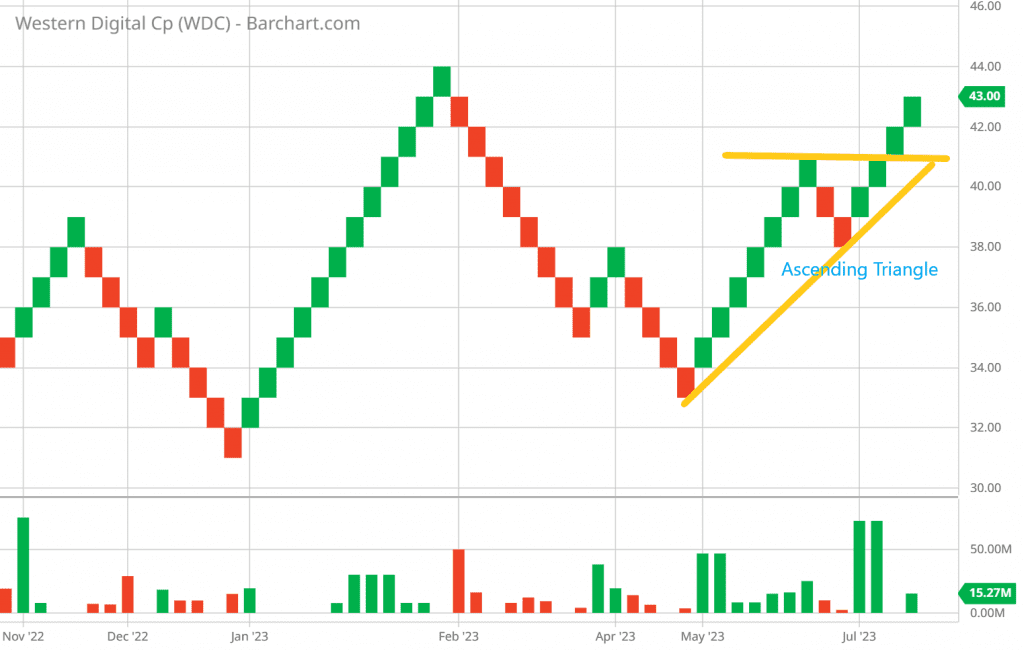
Spotting Triangle Patterns on Renko Charts
To identify ascending and descending triangles on Renko charts:
- Draw horizontal and diagonal trendlines to encapsulate the pattern.
- Notice the steady price movements toward the flat trendline.
Measuring Price Targets Using Renko-Based Triangles
- Ascending Triangle: The vertical distance between the horizontal resistance line and the ascending support line can be added to the breakout point to estimate the potential price target.
- Descending Triangle: Subtract the vertical distance between the descending resistance line and the flat support line from the breakout point to estimate the potential price target.
Understanding these triangle patterns on Renko charts can enhance traders’ abilities to predict future price movements and make informed trading decisions.
Inverted Head and Shoulders Pattern on Renko Charts
The inverted head and shoulders pattern is a reversal pattern that mirrors the traditional head and shoulders but signifies a potential shift from a bearish to a bullish trend. This pattern is recognized by three troughs: a lower trough (head) flanked by two higher troughs (shoulders) on either side. On Renko charts, the clarity of this pattern’s structure can help traders identify potential trend reversals with confidence.
Exploring the Inverted Head and Shoulders Pattern
- Left Shoulder: The left shoulder represents a lower trough followed by a temporary rally in price.
- Head: The head is the lowest trough, signaling a strong bearish trend. A retracement follows, typically not reaching the level of the left shoulder.
- Right Shoulder: The right shoulder is the third trough, similar in depth to the left shoulder. It signifies another retracement after the head.
- Neckline: The neckline connects the highs of the two peaks that form between the shoulders and the head.
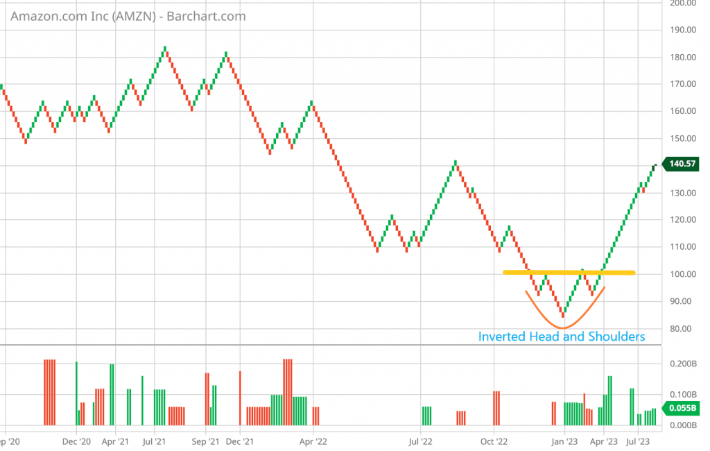
How to Identify on Renko Charts
To identify an inverted head and shoulders pattern on Renko charts:
- Observe a sequence of lower lows (head) and higher lows (shoulders).
- Pay attention to the neckline connecting the highs between the peaks.
- A breakout above the neckline confirms the pattern.
Real-World Example and Its Implications
Imagine a Renko chart of ABC stock exhibiting an inverted head and shoulders pattern:
- Left Shoulder: Price drops to $30 and then retraces.
- Head: The price declines to $25, forming the head.
- Right Shoulder: The price retraces to $28.
- Neckline Breakout: A rally above the neckline at $32 confirms the pattern, suggesting a potential reversal to a bullish trend.
Traders who identify the inverted head and shoulders pattern on Renko charts can anticipate bullish trend reversals and make well-timed trading decisions.
Flag Patterns on Renko Charts
Flag patterns are short-term continuation patterns that emerge after a strong price movement, followed by a brief consolidation represented by a rectangular flag shape. These patterns allow traders to anticipate the resumption of the previous trend. On Renko charts, flag patterns stand out due to their clear definition and reduced noise.
Defining Flag Patterns and Their Characteristics
- A flagpole represents the initial strong price movement.
- The flag is a rectangular consolidation phase that follows the flagpole.
Detecting Flags on Renko Charts
To spot flag patterns on Renko charts:
- Identify a strong price movement (flagpole) followed by a rectangular consolidation (flag).
- Observe reduced price fluctuations within the flag.
Trading Strategies for Flags on Renko Charts
- Bullish Flag: After an upward price movement, the bullish flag suggests a brief consolidation before a potential continuation of the bullish trend. A breakout above the flag’s upper boundary may signal a buying opportunity.
- Bearish Flag: Following a downward price movement, the bearish flag indicates a temporary consolidation before a possible continuation of the bearish trend. A breakout below the flag’s lower boundary could be an indication to consider short positions.
Flag patterns on Renko charts provide traders with a quick and efficient way to identify consolidation phases and potential trend continuation points.
Cup and Handle Pattern Revisited on Renko Charts
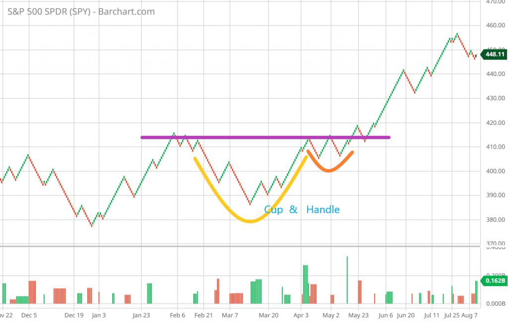
The cup and handle pattern is a bullish continuation pattern that signals a potential upward trend continuation after a period of consolidation. While traditionally associated with bar and candlestick charts, this pattern can also be applied to Renko charts with some adjustments. Understanding how the cup and handle pattern works on Renko charts can provide traders with valuable insights.
In-Depth Analysis of the Cup and Handle Pattern
- Cup Formation: The cup is formed by a rounded bottom, resembling a saucer or cup. It signifies a gradual price recovery from a previous decline.
- Handle Formation: Following the cup, a smaller consolidation forms, known as the handle. It’s characterized by a slight downward movement in price.
Comparing Cup and Handle Patterns on Renko and Other Charts
- Renko Charts: The cup and handle pattern on Renko charts benefits from reduced noise, making the pattern’s formation and breakout more evident.
- Bar/Candlestick Charts: Traditional charts show more price fluctuations, making it important to focus on the general shape of the pattern rather than individual price levels.
Applying Renko-Specific Insights to the Pattern
- Cup Depth: On Renko charts, the depth of the cup can be more pronounced due to the filtering of minor fluctuations.
- Handle Breakout: A breakout above the handle’s resistance line confirms the pattern. Renko charts provide a clear view of this breakout.
Understanding the cup and handle pattern’s adaptation to Renko charts can assist traders in identifying potential bullish continuation trends and strategic entry points.
Gaps and Breakaway Patterns on Renko Charts
Gaps are price jumps between two trading periods, indicating significant market activity. Breakaway patterns involving gaps signal potential trend changes and are crucial to technical analysis. On Renko charts, gaps and breakaway patterns are particularly clear due to the elimination of intraday noise.
Investigating More Complex Patterns Like Triple Tops/Bottoms
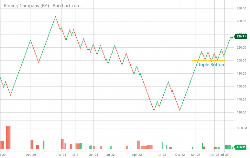
- Triple Tops: These patterns feature three peaks at approximately the same level, suggesting a potential reversal to a bearish trend. Renko charts enhance the visibility of triple tops due to their noise-filtering nature.
- Triple Bottoms: Characterized by three troughs at nearly the same level, triple bottoms indicate a potential shift to a bullish trend. Renko charts provide a clearer view of this pattern’s formation.
Interpreting Complex Patterns on Renko Charts
- Breakaway Gaps: These occur at the beginning of a new trend, indicating a strong movement away from the previous trading range. Renko charts reveal these gaps distinctly.
- Measuring Gaps’ Significance: Gaps’ size and context determine their significance. Renko charts help traders evaluate gaps with precision.
Tips for Confidently Trading Complex Renko-Based Patterns
- Focus on the general pattern structure and price levels.
- Combine pattern analysis with other technical indicators for confirmation.
- Consider using Renko-specific insights to refine trading decisions.
Renko charts empower traders to navigate complex patterns like triple tops/bottoms and interpret breakaway gaps with clarity, leading to more informed trading strategies.
Pattern Confirmation with Renko’s Clarity
Pattern confirmation is a crucial step in technical analysis, ensuring that the identified chart pattern is valid before executing trades. Renko charts offer a unique advantage in pattern confirmation due to their ability to filter out noise and present a clear view of price movements.
Highlighting Renko Chart’s Ability to Filter Out Noise
Renko charts excel at eliminating minor price fluctuations, providing a clearer depiction of significant price movements and patterns.
Confirming Pattern Signals with Renko’s Clarity
- Reduced Noise: Renko charts make it easier to distinguish actual pattern signals from random price fluctuations.
- Enhanced Visibility: Patterns like support and resistance, trend lines, and chart patterns are more evident on Renko charts.
- Avoiding False Signals: Renko’s noise reduction minimizes false signals, leading to more accurate pattern confirmation.
Improving Pattern Accuracy
- Combining with Indicators: Use Renko charts in conjunction with other technical indicators for additional confirmation.
- Comparing Patterns: Compare patterns identified on Renko charts with patterns on other chart types for more comprehensive analysis.
Pattern confirmation on Renko charts is a critical step that traders can leverage to enhance the accuracy of their trading decisions.
Comparing Renko Patterns with Other Chart Types
Different types of charts, such as candlestick charts and bar charts, have their own strengths and weaknesses in displaying patterns. Comparing these chart types with Renko charts can provide insights into the unique benefits Renko charts offer for technical analysis.
Analyzing the Differences in Pattern Visibility and Reliability
- Renko Charts: Clearer patterns due to noise reduction. Ideal for spotting trends and key levels like support and resistance.
- Candlestick Charts: Provide detailed information about open, close, high, and low prices, but patterns can be obscured by noise.
- Bar Charts: Similar to candlestick charts but present price information in a different format.
Renko vs. Candlestick Charts: Which is Better for Trading?
Identifying Strengths and Weaknesses of Renko Patterns
- Strengths: Noise reduction, clearer trend identification, enhanced support and resistance levels, and precise pattern visibility.
- Weaknesses: Less detailed price information, potential for missing small price fluctuations.
Leveraging Renko Patterns for Strategic Analysis
Renko charts excel in providing a simplified and focused view of price movements. Traders can use Renko patterns to complement their analysis on other chart types, enhancing their overall understanding of market trends.
This comprehensive comparison highlights the benefits of Renko patterns and their unique attributes in technical analysis compared to other chart types.
With this, we’ve covered various chart patterns and their applications on Renko charts. Next, let’s delve into the importance of support and resistance levels on Renko charts.

Support and Resistance on Renko Charts
Support and resistance are fundamental concepts in technical analysis that help traders identify key price levels where trends might reverse or continue. Renko charts, with their noise-filtering characteristics, offer a clear view of these levels, enabling traders to make informed decisions regarding entry, exit, and risk management.
Understanding Support and Resistance
Support is a price level where a financial instrument tends to stop falling and may even bounce back upward. Resistance is the opposite, where price tends to stop rising and may reverse downward. These levels are influenced by supply and demand dynamics, psychological factors, and market sentiment.
Filtering Minor Price Fluctuations with Renko Charts
Renko charts are known for their ability to eliminate noise caused by minor price movements, providing a smoother depiction of trends. This clarity makes it easier to identify significant support and resistance levels without distractions from small price fluctuations.
Identifying Support and Resistance Levels on Renko Charts
Renko charts reveal support and resistance levels that might not be as apparent on other chart types. Here’s how to identify them:
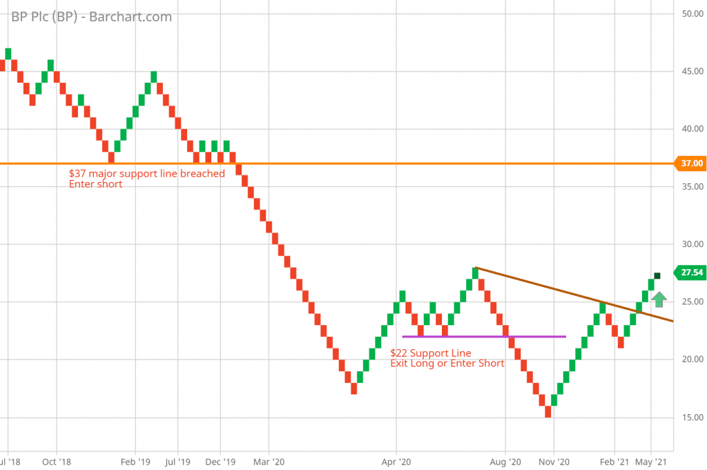
- Horizontal Lines: Draw horizontal lines across levels where price stalls or reverses, forming clear support or resistance zones.
- Trendline Analysis: Identify trendlines connecting the lows (support) or highs (resistance) on Renko charts, highlighting the key levels.
How Renko Charts Reveal Support/Resistance Better
Renko charts enhance the visibility of support and resistance levels:
- Consolidated Data: Noise reduction helps identify levels where price has historically reacted, indicating areas of interest for traders.
- Clear Breaks: Breakouts and breakdowns are often more evident on Renko charts due to the reduction in noise.
Examples of Strong Support/Resistance Areas
Consider an example of a Renko chart for XYZ stock:
- Support Area: The price consistently bounces off a level around $50, indicating strong support.
- Resistance Area: The price repeatedly struggles to move beyond $70, creating a robust resistance level.
Utilizing Support and Resistance in Trading
Support and resistance levels are valuable tools for trading strategies:
- Shorting Near Resistance: Traders might consider short positions when the price approaches a known resistance level, expecting a reversal.
- Buying Near Support: Conversely, traders might look for opportunities to go long as the price nears a confirmed support level.
If you want a complete step-by-step walkthrough showing how I actually draw and trade these levels, see my full guide on Renko support and resistance.
Breakout Strategies Using Renko Charts
Breakouts occur when price breaches a well-established support or resistance level. Renko charts provide an uncluttered view of these breakouts:
- Support Breakout: A price drop below a support level may signify a reversal to a bearish trend.
- Resistance Breakout: A price rise above a resistance level might indicate a shift to a bullish trend.
Conclusion
Renko charts simplify the identification and interpretation of support and resistance levels, enhancing traders’ ability to make well-informed trading decisions. Understanding these levels empowers traders to enter and exit positions strategically and manage risk effectively.
With a solid grasp of support and resistance, we can now move on to exploring the applications of moving averages on Renko charts.

Moving Averages and Renko Charts
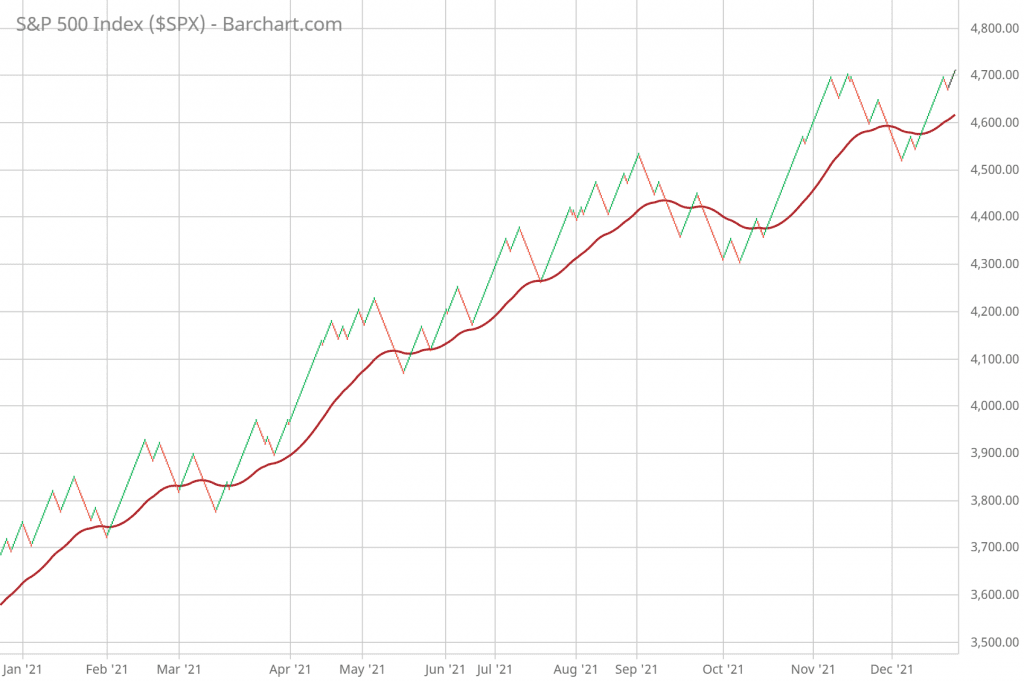
Moving averages are versatile tools in technical analysis, used to smooth out price data and identify trends. When applied to Renko charts, moving averages can offer valuable insights into trend direction, potential reversals, and areas of support and resistance.
Introduction to Moving Averages
Moving averages (MA) calculate the average price over a specific number of periods, providing a smoothed line that filters out short-term fluctuations. They help traders identify the overall trend direction and potential turning points.
Applying Moving Averages to Renko Charts
Applying moving averages to Renko charts involves adapting the traditional concept to Renko’s unique structure. Instead of considering time-based periods, you’ll use the number of Renko bricks or boxes.
Challenges of Using Traditional Moving Averages
Traditional moving averages face challenges on Renko charts due to the absence of time. The relationship between bricks and time periods might vary, impacting the effectiveness of certain MAs.
Adaptations for Renko Charts
To address the challenges, traders can:
- Use Fixed Bricks: Utilize a fixed number of bricks for the moving average calculation, adapting it to the Renko chart’s structure.
- Combine Bricks with Time Periods: Employ a hybrid approach by considering both bricks and time periods for moving average calculations.
Benefits of Moving Averages on Renko Charts
Moving averages can assist in trend identification, entry and exit points, and confirming trend reversals on Renko charts:
- Trend Identification and Confirmation: Moving averages help determine the prevailing trend and its strength.
- Crossovers on Renko Charts: Moving average crossovers (e.g., short-term crossing over long-term) indicate potential entry or exit points.
Combining Moving Averages with Other Indicators
Renko charts can be enriched by integrating moving averages with other indicators like the Relative Strength Index (RSI) and Moving Average Convergence Divergence (MACD):
- RSI and MACD with Renko Charts: Using RSI alongside moving averages can provide insight into overbought and oversold conditions. MACD can highlight trend momentum.
- Enhancing Technical Analysis Using Multiple Indicators: The combination of indicators can lead to more comprehensive trading strategies.
Advanced Renko Chart Strategies for Experienced Traders
Conclusion
Moving averages offer a versatile approach to analyzing trends and potential reversals on Renko charts. By adapting these indicators to the unique structure of Renko charts, traders can enhance their ability to make well-informed trading decisions and navigate market trends with confidence.
With moving averages covered, let’s delve into the significance of trend lines on Renko charts in the next section.

Trend Lines and Renko Charts
Trend lines are powerful tools in technical analysis, helping traders identify the direction and strength of trends. When applied to Renko charts, trend lines take on a clearer form, allowing traders to make more accurate trend assessments and strategic trading decisions.
Importance of Trend Lines in Technical Analysis
Trend lines are fundamental tools that help traders understand the underlying trend of an asset. They provide a visual representation of the price’s direction over a specific period and serve as a basis for trend identification.
Drawing Trend Lines on Renko Charts
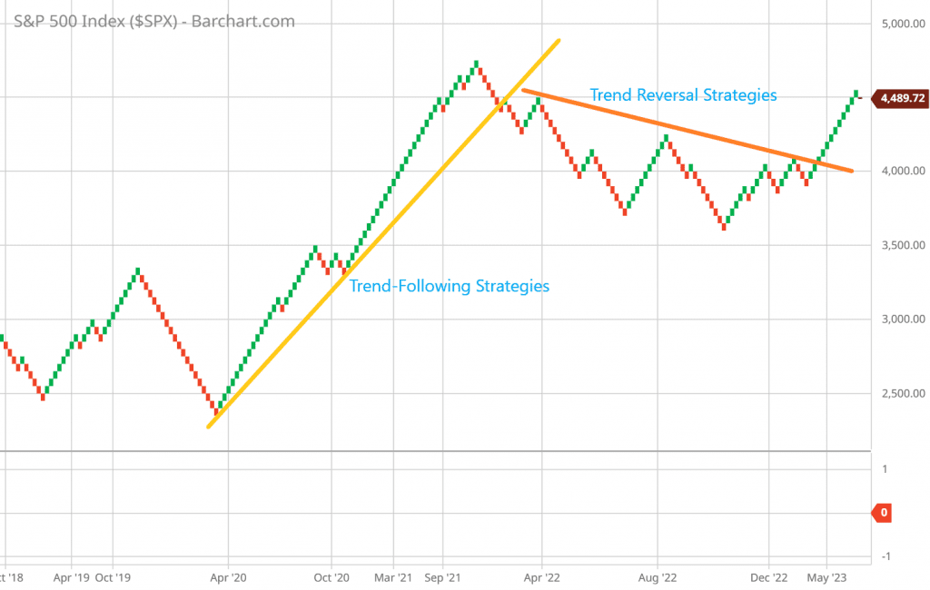
Drawing trend lines on Renko charts involves connecting the highs or lows of price movements. Trend lines can be ascending (uptrend), descending (downtrend), or horizontal (sideways trend).
Validating Trend Lines on Renko Charts
Renko charts enhance the validity of trend lines due to their noise-filtering nature. Since Renko charts eliminate minor fluctuations, the trend lines drawn on them tend to be more reliable and accurate.
Analyzing Trends with Renko Chart Trend Lines
Trend lines on Renko charts provide insights into trend strength and potential reversals:
- Steeper vs. Shallower Trends on Renko Charts: The angle of the trend line can indicate the intensity of the trend.
- Trend Line Breaks and Their Implications: A breakout or breakdown of a trend line can signal potential trend reversals.
Trading Strategies with Renko Chart Trend Lines
Trend lines offer strategic opportunities for traders:
- Trend-Following Strategies: Traders can enter positions in the direction of the prevailing trend when price touches or bounces off the trend line.
- Trend Reversal Strategies: Breakouts or breakdowns of trend lines can be used to identify potential trend reversals and initiate trades.
Conclusion
Trend lines on Renko charts provide traders with a clear and accurate way to assess trends and make informed trading decisions using Renko charts technical analysis. The noise-filtering characteristics of Renko charts enhance the reliability of trend lines, making them valuable tools for trend identification, entry and exit points, and overall technical analysis.

Pattern Confirmation and Comparisons
Renko charts excel in confirming chart patterns and providing a clear view of market dynamics. Let’s uncover how Renko’s clarity enhances pattern validation and how Renko patterns compare to other chart types.
Confirming Patterns with Renko’s Clarity
Highlighting Pattern Clarity:
- Renko charts’ noise filtering minimizes false signals, leading to more accurate pattern confirmations.
- Traders can confidently rely on Renko’s clear visual representation for pattern validation.
Avoiding False Signals:
- Renko charts’ structure reduces the impact of minor price fluctuations, reducing false pattern signals.
- Traders can avoid unnecessary trades triggered by noise on traditional charts.
Improving Pattern Accuracy:
- Renko charts’ ability to highlight significant price movements enhances the precision of pattern signals.
- Traders can make more informed decisions with a higher likelihood of accurate outcomes.
Comparative Analysis of Renko Patterns
Strengths of Renko Patterns:
- Renko patterns are less prone to noise and random fluctuations, leading to stronger patterns.
- Traders benefit from clearer and more reliable signals, enhancing their trading strategies.
Comparing with Other Chart Types:
- Renko patterns can be compared with patterns on candlestick or bar charts.
- Identifying patterns’ consistency and effectiveness across different chart types provides a comprehensive view.
Enhanced Pattern Visibility:
- Renko’s focus on significant price movements makes patterns more visible.
- Traders can identify subtle patterns that might be lost on traditional charts.
Conclusion
As we conclude our journey through Renko charts’ technical analysis, we’ve unraveled the unique features that set them apart. From understanding the application of various chart patterns to leveraging advanced insights and pattern confirmation, Renko charts provide traders with a refined analytical approach. By harnessing their noise-filtering capabilities, Renko charts empower traders to make well-informed decisions based on clear and reliable patterns. As you navigate the world of trading, remember that mastering Renko charts offers a transformative potential in refining your Renko charts technical analysis strategies.
