Overview
Parabolic SAR Cycle Analysis
The purpose of this post is to examine the weekly chart of the SP 500 [$SPX] using the Parabolic SAR indicator and Cycles, i.e. Parabolic SAR Cycle Analysis, to see if we can make sense of the SP 500 price patterns and trends.
What is Parabolic SAR?
The Parabolic SAR is a technical indicator used to assist in determining the direction of an instrument’s price movement. SAR is an abbreviation for “stop and reverse.”
The Parabolic SAR indicator is represented by a sequence of dots above or below the price bars. It is considered a bullish trend when a dot is below the price bar. When a dot is above the price bar, it indicates a bearish trend.
When the price begins to rise, so will the dots. The term “parabolic” refers to how the initial few dots rise slowly before picking up pace and accelerating with the increasing trend. They act similarly in a decline. When the dots flip, it signals either a future price direction shift or a halt in the current trend. If the present trend pauses, the instrument enters a price corrective phase. Nonetheless, the underlying trend remains unchanged.
What is Cycle Analysis?
A cycle is used to determine the length of an event and the frequency with which it is repeated. To foresee turning points, price and time cycles are utilized. Cycles do exist, but they tend to fluctuate over time, and the length of each cycle might vary.
Price highs and lows can not be predicted using cycle analysis. It may, however, depict the rise and fall of prices over time and aid in anticipating or determining turning points.
Parabolic SAR Cycle Analysis

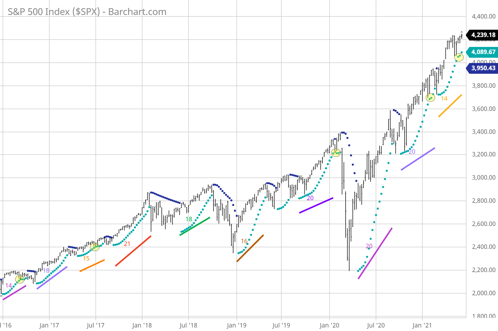
The uptrend, denoted by the dots beneath the price bars, is visible in the SP 500 [ $ SPX] Weekly chart above from July 2016 to today. The number of bars, or weeks, is computed and displayed on the chart at the end of each cycle. We can easily observe that uptrends often last for 14 to 21 weeks. The average, omitting the most recent cycle, which has yet to be finished, is 18 bars [weeks].
We may argue that the current upswing is coming to an end, but we don’t know if it has one more week or seven to go, presuming 21 is the maximum number based on the historical data above. We also don’t know the magnitude the correction will be.
Another thing to keep in mind is that the trend tends to terminate shortly after the dots reach relatively close to the bottom of the price bars, as shown in the yellow circles on the chart above. It signaled that the trend was ready to pause or alter itself, but the bulls were not about to give up. In the weeks that followed, the bulls pushed the price higher as a last ditch effort before giving up.
Takeaways
- The parabolic “SAR,” or stop and reverse, can assist in identifying appropriate exit and entry points.
- The weekly chart above shows the rising SAR cycles that last between 14 and 21 weeks.
- The latest uptrend SAR cycle is currently in the 14th week. It’s getting close to the end. Perhaps it’s time to think about covered calls to safeguard against the downside.
- One thing to keep in mind is that as the dots reach near the bottom of the price bars, the uptrends tend to terminate within 1 to 3 weeks. See the yellow circles in the chart above.