Table of Contents
Introduction to Renko charts
When it comes to trading in the financial markets, having the right tools and techniques can make all the difference. One such tool that has gained popularity among traders is the Renko chart. In this article, we will explore the world of Renko charts and compare them to traditional chart types such as candlesticks, line charts, and bar charts. By understanding the advantages and disadvantages of each chart type, you can make informed decisions and increase your chances of trading success.
Understanding traditional chart types – candlesticks, line charts, and bar charts
Before diving into Renko charts, it is important to have a basic understanding of traditional chart types. Candlestick charts, line charts, and bar charts are widely used in technical analysis and provide valuable insights into price movements over time.
Candlestick Charts
Candlestick charts are perhaps the most popular chart type among traders. They display the open, high, low, and close prices for a given time period in the form of candlestick-shaped bars. These charts are visually appealing and provide a wealth of information about market sentiment and trend direction.
Line Charts
Line charts, on the other hand, are simple and easy to read. They connect the closing prices of an asset over time, creating a continuous line. Line charts are useful for identifying long-term trends but may not provide as much detail as candlestick charts.
Bar Charts
Bar charts are similar to candlestick charts but do not include the visual representation of a candlestick. Instead, they use vertical lines to represent the high and low prices, while horizontal lines on each side of the vertical line represent the opening and closing prices.
Use Cases for Candlesticks, Line Charts, and Bar Charts
Each traditional chart type has its own set of use cases and can be effective depending on the trading strategy and individual preferences. Let’s delve deeper into each of these traditional chart types and provide more detailed use cases and examples to illustrate their effectiveness in different trading scenarios.
Candlestick Charts
Use Cases:
- Trend Reversals: Candlestick charts are excellent for identifying trend reversals. Traders often look for patterns like the “Hammer” or “Shooting Star” to anticipate a shift in market sentiment. For instance, a series of bearish candlestick patterns followed by a bullish reversal pattern can signal a potential upward trend reversal.
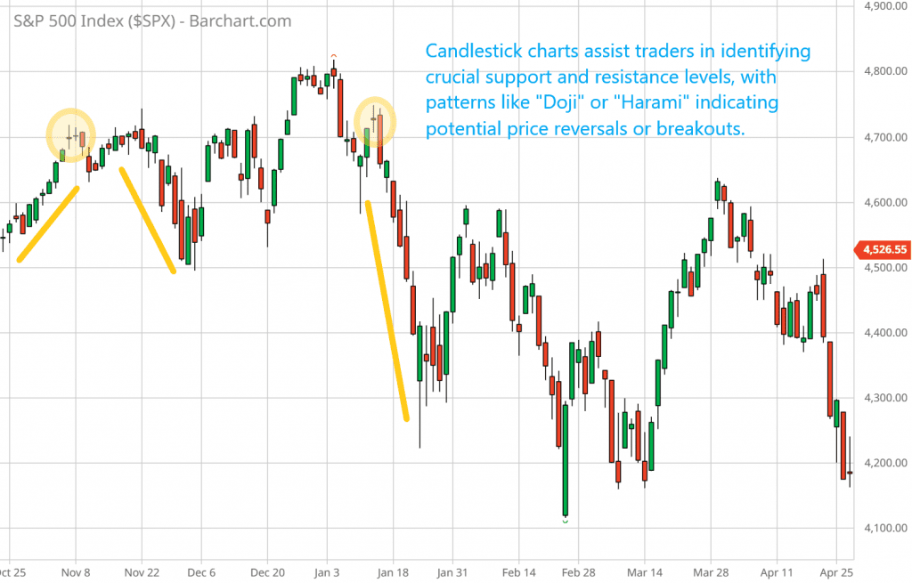
- Support and Resistance Levels: Candlestick charts help traders spot critical support and resistance levels. Patterns like “Doji” or “Harami” at these levels can suggest potential price reversals or breakouts.
- Price Patterns: Candlestick charts are renowned for highlighting price patterns like “Bullish Engulfing” and “Bearish Harami.” Traders use these patterns to make informed decisions, such as entering or exiting positions.
Illustration: Imagine you’re analyzing a candlestick chart for a particular stock. You notice a series of “Doji” patterns forming near a significant support level. This indicates indecision in the market and might be a signal to watch closely for a potential price reversal.
Line Charts
Use Cases:
- Long-Term Trends: Line charts are valuable for identifying long-term trends and overall market direction. By connecting closing prices over an extended period, traders can visualize the underlying trend more clearly.
- Noise Reduction: In noisy markets with frequent price fluctuations, line charts provide a smoother representation of price movements. This helps traders focus on the broader market trend without getting distracted by short-term fluctuations.
Illustration: Suppose you’re analyzing the performance of a cryptocurrency over the past year. By using a line chart, you can easily spot an upward trend in the price, making it clear that the overall market sentiment has been bullish.
Bar Charts
Use Cases:
- Patterns and Trend Reversals: Bar charts, similar to candlestick charts, are useful for identifying patterns and trend reversals. Traders can spot patterns like “Double Tops” or “Head and Shoulders” formations in bar charts.
- Simplified View: Bar charts provide a simplified representation of price action. Each bar represents a specific time interval (e.g., day, hour), making it easier for traders to analyze price changes over discrete periods.
Illustration: Imagine you’re analyzing a bar chart for a commodity. You notice a consistent pattern where each time a price reaches a certain level, it experiences a reversal. This repetitive pattern helps you make informed trading decisions based on historical price behavior.
In summary, the choice of chart type should align with your trading strategy and the specific insights you seek. Candlestick charts are powerful for short-term analysis, line charts are suitable for long-term trend identification, and bar charts provide a simplified view of price action. Traders often use a combination of these charts to gain a comprehensive understanding of the market.
The advantages and disadvantages of candlestick charts, line charts, and bar charts
Let’s explore the advantages and disadvantages of each traditional chart type—candlestick charts, line charts, and bar charts—in greater detail, along with illustrative use cases.
Candlestick Charts
Advantages:
- Detailed Market Sentiment: Candlestick charts offer rich insights into market sentiment. Each candle represents a specific time period and provides information on the opening, closing, high, and low prices during that period. Traders can quickly assess whether buyers or sellers are in control.
- Trend Direction: Candlestick patterns like “Bullish Engulfing” and “Bearish Harami” help traders identify trend reversals and continuation patterns, enabling them to make well-informed decisions.
- Price Patterns: Candlestick charts highlight various price patterns that can be used to predict future price movements. This includes patterns like “Morning Star” or “Evening Star” that suggest potential reversals.
Disadvantages:
- Learning Curve: Candlestick charts can be overwhelming for beginners due to the vast number of patterns and formations to learn. It takes time and practice to become proficient at recognizing and interpreting these patterns.
- Information Overload: In fast-paced markets, the constant changes in candlestick patterns can lead to information overload, making it challenging to make quick decisions.
Illustration: Suppose you’re an experienced trader analyzing a candlestick chart for a currency pair. You notice a “Bullish Harami” pattern forming after a prolonged downtrend. This pattern signals a potential trend reversal, prompting you to consider a long position.
Line Charts
Advantages:
- Simplicity: Line charts are straightforward and easy to understand, making them ideal for beginners. They connect closing prices over time, providing a smooth and clear representation of the overall trend.
- Long-Term Trend Identification: Line charts excel at identifying long-term trends, making them valuable for investors looking to assess the broader market direction.
Disadvantages:
- Lack of Detail: Line charts lack the granularity of candlestick charts and bar charts. They do not show high and low prices within a given period, which can make it challenging to identify precise entry and exit points.
Illustration: Imagine you’re a long-term investor analyzing a line chart for a tech company’s stock over several years. The line steadily slopes upward, indicating a consistent long-term growth trend.
Bar Charts
Advantages:
- Balance of Detail and Simplicity: Bar charts strike a balance between candlestick charts and line charts. They provide essential information about price action, including opening, closing, high, and low prices, without overwhelming traders with excessive details.
- Pattern Recognition: Bar charts allow traders to identify patterns and trend reversals, similar to candlestick charts, but in a more simplified format.
Disadvantages:
- Less Detail than Candlesticks: While bar charts offer more detail than line charts, they still lack the comprehensive information provided by candlestick charts.
Illustration: Consider you’re a swing trader analyzing a bar chart for a stock. You notice a consistent pattern where the stock tends to reverse direction after reaching a specific high. This pattern guides your decision to enter short positions near that price level.
In conclusion, each traditional chart type has its own unique advantages and disadvantages. Candlestick charts offer detailed insights but come with a learning curve. Line charts provide simplicity and long-term trend identification. Bar charts strike a balance between detail and simplicity, making them suitable for a wide range of traders. The choice ultimately depends on your trading style, experience, and specific analytical needs. Traders often use a combination of these charts to gain a comprehensive view of the market.
What are Renko charts and how do they work?
Now that we have covered the basics of traditional chart types, let’s dive into Renko charts. Renko charts originated in Japan and are unique in their construction. Unlike traditional charts that are based on time intervals, Renko charts focus solely on price movement.
Renko charts consist of bricks or blocks that are formed based on a predefined price movement. For example, if the chosen price movement is $1, a new brick will only be formed when the price moves up or down by $1. This eliminates the factor of time and focuses solely on price action.
The size of the bricks can be customized based on the trader’s preference and the volatility of the asset being traded. Renko charts are known for their ability to filter out noise and provide a clearer view of trend direction.
Advantages of Renko charts over traditional chart types
Renko charts offer several advantages over traditional chart types.
Advantage 1: Noise Elimination
Renko charts eliminate the noise and distractions caused by minor price fluctuations. This makes it easier to identify the overall trend and reduces the chances of false signals.
Advantage 2: Objective Price Action
Renko charts provide a more objective view of price action. Since the brick size is based solely on price movement, there is no room for interpretation or subjectivity. This can be particularly useful for traders who prefer a rule-based approach to trading.
Advantage 3: Clear Support and Resistance Levels
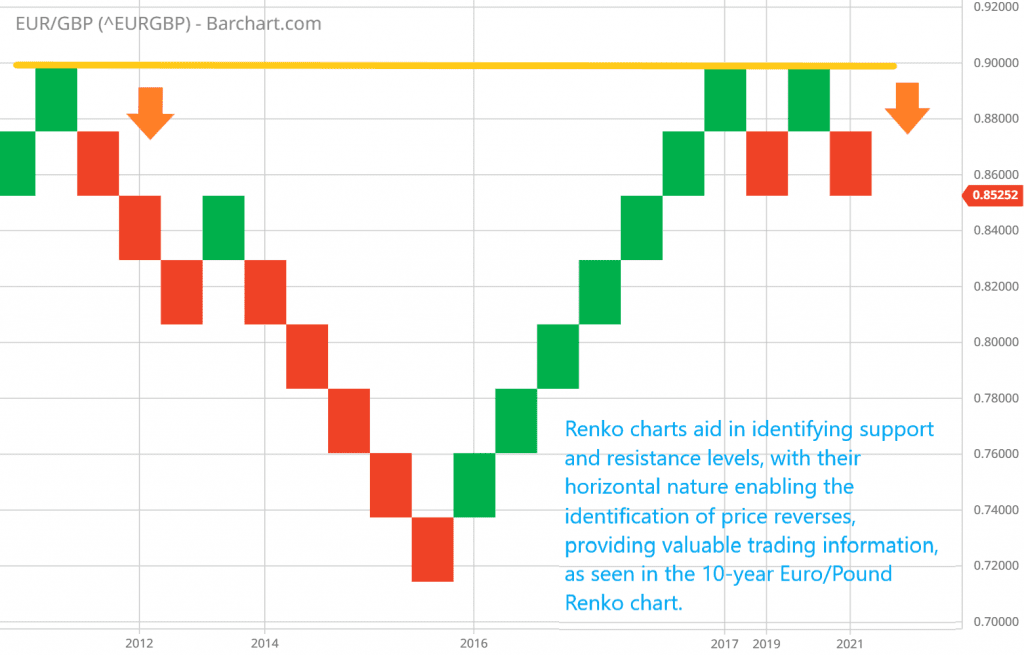
Furthermore, Renko charts can help identify support and resistance levels more clearly. The horizontal nature of the bricks makes it easier to spot areas where price has repeatedly reversed direction, providing valuable information for trading decisions.
Key differences between Renko charts and other popular chart types
While Renko charts share some similarities with traditional chart types, there are key differences that set them apart.
Difference 1: Elimination of Time
The most obvious difference is the elimination of time as a factor in Renko charts. Traditional charts are based on time intervals, whereas Renko charts focus solely on price movement.
Difference 2: Visual Representation of Price Action
Another key difference is the visual representation of price action. Renko charts use bricks or blocks to represent price movement, while candlestick charts, line charts, and bar charts use different shapes and colors.
Difference 3: Noise Reduction and Clarity
Additionally, Renko charts have a unique ability to filter out noise and provide a clearer view of trend direction. Traditional charts may be more susceptible to false signals caused by minor price fluctuations.
How to use Renko charts for trading success
Now that we understand the advantages and differences of Renko charts, let’s explore how to use them for trading success.
Step 1: Determine the Brick Size
The first step is to choose an appropriate brick size based on the volatility of the asset being traded. For instance, in a high-volatility market, where price swings are substantial, a smaller brick size, like one point, might be suitable. Conversely, in a low-volatility market, a larger brick size, such as five points, could be more appropriate.
Use Case: Consider trading a cryptocurrency known for its price volatility. By setting a smaller brick size, you can capture more granular price movements and respond quickly to short-term trends.
ATR-Based Renko Chart Brick Size Calculation: Proven Tips and Tricks
Step 2: Identify Trend Direction
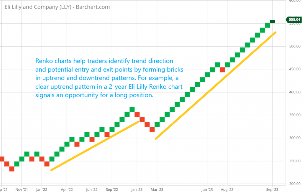
Once the brick size is determined, traders can use Renko charts to identify trend direction and potential entry and exit points. In an uptrend, Renko charts show a series of bricks forming higher highs and higher lows, while in a downtrend, the chart displays a series of bricks forming lower highs and lower lows.
Use Case: You’re analyzing Renko charts for a popular tech stock. You notice a consistent pattern of higher highs and higher lows forming over several weeks. This clear uptrend signals an opportunity for a long position.
Step 3: Use Additional Tools and Indicators
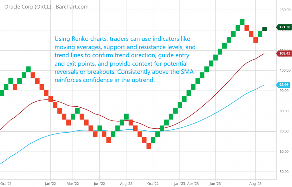
Traders can further enhance their trading decisions when using Renko charts by employing additional indicators and tools. These may include moving averages, support and resistance levels, and trend lines. Moving averages can help confirm the trend direction, while support and resistance levels can guide entry and exit points. Trend lines can provide additional context for potential reversals or breakouts.
Use Case: Suppose you’re trading a forex pair using Renko charts. To confirm your trend analysis, you overlay a simple moving average (SMA) on the chart. When the Renko bricks consistently stay above the SMA, it reinforces your confidence in the ongoing uptrend.
In summary, using Renko charts involves three key steps: determining the brick size based on market volatility, identifying trend direction through brick patterns, and enhancing your analysis with additional indicators and tools. These steps can help traders make informed decisions and navigate the complexities of the financial markets more effectively.
Advanced strategies for trading with Renko charts
For experienced traders looking to take their Renko chart analysis to the next level, there are advanced strategies that can be implemented.
Advanced Strategy 1: Multiple Renko Brick Sizes
One advanced strategy involves using multiple Renko brick sizes. This approach allows traders to gain a better understanding of both short-term and long-term trends simultaneously.
Illustration: Imagine you’re trading a volatile cryptocurrency. You decide to use two Renko brick sizes: a smaller brick size for short-term analysis (e.g., capturing day-to-day fluctuations) and a larger brick size for long-term analysis (e.g., identifying major trend shifts). By doing this, you can have a comprehensive view of the market’s movements and make more nuanced trading decisions.
Advanced Strategy 2: Combining Renko Charts with Technical Indicators
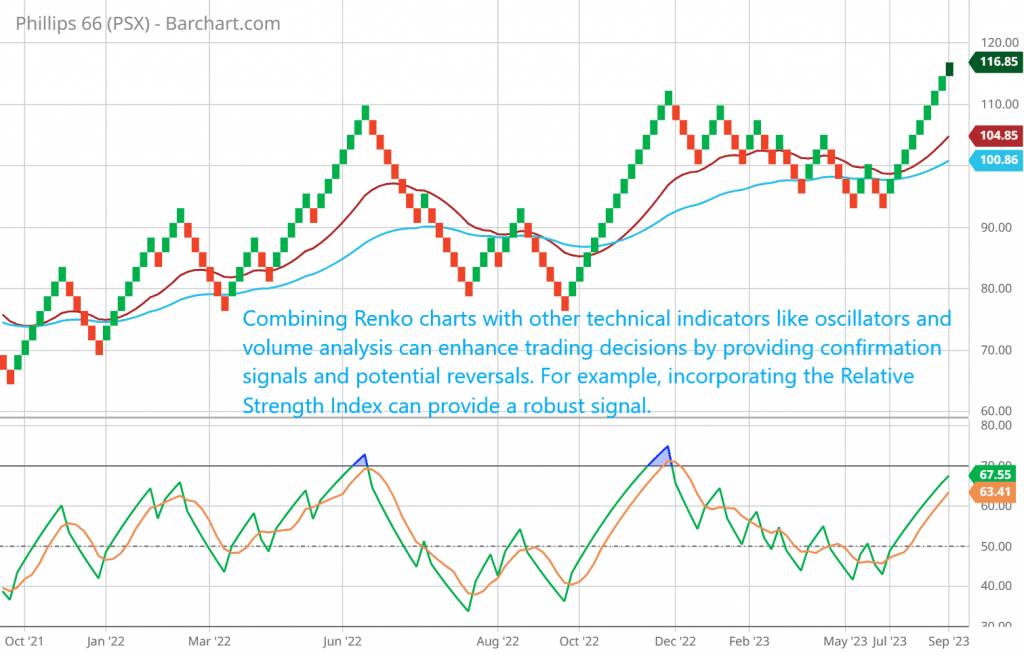
Another advanced strategy is to combine Renko charts with other technical indicators such as oscillators and volume analysis. This integration can provide additional confirmation signals and enhance the accuracy of trading decisions.
Illustration: Suppose you’re analyzing Renko charts for a stock. To strengthen your analysis, you incorporate the Relative Strength Index (RSI), an oscillator indicator. When the Renko chart suggests an uptrend and the RSI shows overbought conditions, it may indicate a potential reversal, providing you with a more robust signal to consider.
Renko and Indicators Synergy: 5 Dynamic Strategies for Trading Success
Advanced Strategy 3: Experimenting with Charting Intervals and Time Frames
Traders can also experiment with different charting intervals and time frames when using Renko charts. This flexibility allows them to identify the most effective combination that aligns with their trading style and the specific asset being traded.
Illustration: Let’s say you’re a day trader interested in a particular currency pair. You decide to experiment with Renko charts using various time frames, such as 1-hour, 4-hour, and 8-hour intervals. By comparing the effectiveness of each interval, you can determine which one provides the most actionable insights for your intraday trading strategy.
In summary, advanced Renko chart strategies include using multiple brick sizes to capture both short-term and long-term trends, combining Renko charts with technical indicators for increased accuracy, and experimenting with different charting intervals and time frames to tailor your analysis to your specific trading needs. These strategies can empower traders with more comprehensive insights and better decision-making capabilities in the market.
5 Dynamic Renko Chart Indicators for Supercharged Analysis
Exploring alternative chart types – Point and Figure Charts and Heikin Ashi
While Renko charts offer a unique perspective on price action, there are other alternative chart types worth exploring.
Point and Figure Charts
Pros:
- Simplicity: Point and Figure charts are easy to understand, as they use X’s and O’s to represent price movements.
- Trend Identification: They excel at identifying trends and trend reversals, with clear and straightforward patterns.
Cons:
- Lack of Time Information: Like Renko charts, Point and Figure charts also eliminate time as a factor, which may limit some traders’ analysis.
- Limited Indicator Integration: They may not work well with some technical indicators that require time-based data.
Illustration: You’re analyzing Point and Figure charts for a stock. The X’s consistently outnumber the O’s, indicating a strong uptrend, which gives you confidence in your long position.
Heikin Ashi Charts
Pros:
- Smoothing Effect: Heikin Ashi charts smooth out price fluctuations, making it easier to identify trends and reversals.
- Clearer Trend Direction: They provide a clearer view of trend direction compared to traditional candlestick charts.
- Compatibility: Heikin Ashi charts can be used with a wide range of technical indicators.
Cons:
- Loss of Detail: They may lose some of the finer details present in standard candlestick charts.
- Subjectivity: While less subjective than Renko charts, some interpretation is still required, as they modify candlestick patterns.
Illustration: You’re using Heikin Ashi charts to analyze a forex currency pair. The smoothed candlesticks reveal a consistent uptrend with fewer false signals, giving you more confidence in your long-term trading strategy.
Heikin Ashi vs. Renko vs. Candlestick Charts: Unleashing Explosive Profits
Combining Renko charts with other chart types for a comprehensive trading analysis
While Renko charts can be powerful on their own, combining them with other chart types can provide a more comprehensive view of the market.
Combining Renko Charts with Candlestick Charts
Use Case: Imagine you’re trading a highly volatile cryptocurrency. You decide to use Renko charts to identify the primary trend and potential turning points. You notice a strong uptrend on the Renko chart. To refine your entry strategy, you switch to candlestick charts to look for specific reversal patterns like “Bullish Engulfing” or “Morning Star” near support levels. This combination allows you to benefit from the Renko chart’s trend clarity while using candlestick charts for precise entry and exit timing.
Advantages:
- Trend Confirmation: Renko charts confirm the overall trend, helping you align your trades with the market’s direction.
- Pattern Recognition: Candlestick charts enable you to identify key reversal patterns and refine your trading decisions.
- Enhanced Precision: The combination helps you make more precise entries and exits by layering trend analysis with pattern recognition.
Combining Renko Charts with Line Charts
Use Case: Consider you’re an investor looking for long-term opportunities in the stock market. You utilize Renko charts to identify and confirm the primary trend, which appears to be upward. To assess the broader market context, you complement your analysis with line charts, connecting closing prices over extended periods. The combination of Renko’s trend confirmation and line charts’ long-term trend identification guides your investment decisions.
Advantages:
- Trend Confirmation: Renko charts verify the dominant trend, helping you make informed investment choices.
- Long-Term Perspective: Line charts provide a clear view of long-term trends, assisting investors in identifying suitable entry points for long-hold positions.
- Reduced Noise: The combination filters out short-term price fluctuations, allowing you to focus on the big picture.
Combining Renko Charts with Bar Charts
Use Case: You’re a swing trader interested in commodities. Renko charts reveal a potential trend reversal, prompting you to investigate further. You switch to bar charts, which offer a more detailed view of price action, including opening and closing prices. This additional information helps you refine your entry and exit points for your swing trade strategy.
Advantages:
- Trend Confirmation: Renko charts provide initial trend confirmation, guiding your trading bias.
- Detailed Price Action: Bar charts offer more comprehensive price data, enabling you to fine-tune your entry and exit strategies.
- Enhanced Decision-Making: The combination allows for a balance between trend clarity and precise price information, improving decision-making.
In summary, combining Renko charts with other chart types can enhance a trader’s ability to analyze and make decisions in various market scenarios. By leveraging the strengths of each chart type, traders can create more comprehensive and effective trading and investment strategies.
Charting software and tools
To effectively use Renko charts and other chart types, it is important to have access to reliable charting software and tools. There are several platforms available that offer advanced charting capabilities and a wide range of technical indicators.
MetaTrader
Features:
- User-Friendly Interface: MetaTrader offers a user-friendly interface that caters to both beginners and experienced traders.
- Customizable Charts: It allows traders to customize their Renko charts and overlay them with other chart types.
- Technical Indicators: MetaTrader comes with a wide range of built-in technical indicators and the ability to install custom indicators.
- Algorithmic Trading: The platform supports automated trading strategies using Expert Advisors (EAs).
- Historical Data: Provides access to historical price data for in-depth analysis.
Use Case: A day trader using MetaTrader combines Renko charts with traditional candlestick charts to identify intraday trends and entry points. The platform’s customizable charts and extensive indicator library help them make informed trading decisions.
TradingView
Features:
- Interactive Charts: TradingView offers highly interactive and visually appealing charts.
- Multi-Chart Layouts: Traders can set up multiple Renko charts alongside other chart types for simultaneous analysis.
- Collaboration: Users can share and discuss charts with the TradingView community.
- Social Features: Traders can follow and learn from other traders’ chart analyses.
- Scripting Language: TradingView supports Pine Script, allowing traders to create custom indicators and strategies.
Use Case: An experienced swing trader uses TradingView to combine Renko charts with Heikin Ashi charts for trend analysis. The platform’s interactive features and ability to share ideas enhance their trading strategy development.
ThinkorSwim (by TD Ameritrade)
Features:
- Advanced Tools: ThinkorSwim offers advanced charting tools, including Renko charts.
- Customization: Traders can customize chart settings and styles to suit their preferences.
- Technical Studies: It provides a wide array of technical studies and indicators.
- Paper Trading: ThinkorSwim offers paper trading capabilities for practice.
- Market Data: Access to real-time market data and news.
Use Case: An options trader uses ThinkorSwim’s Renko charts alongside traditional bar charts to assess the implied volatility of options contracts. The platform’s comprehensive data and technical tools assist in options analysis.
In addition to reliable charting software, traders can explore various technical indicators and tools like moving averages, Bollinger Bands, and Fibonacci retracements to further enhance their chart analysis and trading decisions. These tools offer valuable insights into market trends, volatility, and potential entry or exit points based on historical price data and mathematical calculations.
Renko Chart FAQs: Using Renko Charts for Effective Trading
Q: Are Renko charts suitable for all types of trading?
A: Renko charts can be used in various trading styles and time frames, making them versatile for different strategies. They are particularly useful for trend trading and swing trading strategies. However, it is important to consider the volatility of the asset being traded and choose an appropriate brick size.
Q: How can I determine the optimal brick size for Renko charts?
A: The optimal brick size for Renko charts depends on the volatility of the asset being traded. A smaller brick size may be suitable for high volatility markets, while a larger brick size may be better for low volatility markets. Traders can experiment with different brick sizes to find the most suitable option.
Q: Can Renko charts be used for day trading?
A: Renko charts can be used for day trading, especially when combined with other chart types and technical indicators. Traders can use Renko charts to identify the overall trend and potential entry and exit points, while using other chart types to fine-tune their trading decisions.
Q: Are Renko charts suitable for beginners?
A: Renko charts can be suitable for beginners, particularly those who prefer a rule-based approach to trading. However, it is important for beginners to have a basic understanding of price action and trend analysis before diving into Renko charts.
Q: What are some common mistakes to avoid when using Renko charts?
A: Common mistakes when using Renko charts include:
- Overlooking market context: Traders should consider broader market factors alongside Renko charts.
- Neglecting risk management: Like any trading method, risk management is crucial.
- Using fixed brick sizes: It’s important to adjust brick sizes based on market conditions.
- Ignoring confirmation signals: Traders should confirm Renko chart signals with other technical tools.
- Neglecting fundamentals: While Renko charts focus on price action, fundamental analysis can provide valuable context.
Conclusion and final thoughts for choosing the right chart type for trading success
Choosing the right chart type is crucial for trading success. Traditional chart types such as candlesticks, line charts, and bar charts provide valuable insights into price action and market sentiment. However, Renko charts offer unique advantages such as noise filtering, objective price action analysis, and clearer identification of support and resistance levels.
By understanding the key differences and advantages of each chart type, traders can make informed decisions and tailor their trading strategies to their individual preferences and goals. Whether you choose Renko charts, candlestick charts, or a combination of multiple chart types, the key is to practice and refine your analysis skills to increase your chances of trading success.
Remember to choose reliable charting software and tools to enhance your chart analysis and explore advanced strategies to take your trading to the next level. With the right tools and techniques, you can navigate the financial markets with confidence and achieve your trading goals.
Start exploring Renko charts and other chart types today and unlock new insights for trading success.
Note: This article is for informational purposes only and should not be considered as financial advice. Always do your own research and consult with a professional financial advisor before making any investment decisions.
